LayoutControl
Base class for visual controls that participate in page layout.
LayoutControl extends Control with common visual layout
capabilities, including:
- explicit sizing (
width,height,aspect_ratio); - absolute positioning (
left,top,right,bottom); - parent-space placement (
align,margin); - 2D transforms (
rotate,scale,offset,flip,transform); - implicit animations for those properties (
animate_*); - layout/animation lifecycle events (
on_size_change,on_animation_end).
Use LayoutControl as the base for custom visual controls rendered on
the page surface. For popup controls, use DialogControl;
for non-visual integrations, use Service.
Inherits: Control
Properties
align- Alignment of the control within its parent.animate_align- Enables implicit animation of theLayoutControl.alignproperty.animate_margin- Enables implicit animation of theLayoutControl.marginproperty.animate_offset- Enables implicit animation of theLayoutControl.offsetproperty.animate_opacity- Enables implicit animation of theControl.opacityproperty.animate_position- Enables implicit animation of the positioning properties (LayoutControl.left,LayoutControl.right,LayoutControl.topandLayoutControl.bottom).animate_rotation- Enables implicit animation of theLayoutControl.rotateproperty.animate_scale- Enables implicit animation of theLayoutControl.scaleproperty.animate_size- Enables implicit animation of this control's size.aspect_ratio- The aspect ratio of the control.bottom- The distance that the child's bottom edge is inset from the bottom of the stack.flip- Flips this control horizontally and/or vertically.height- Imposed Control height in virtual pixels.left- The distance that the child's left edge is inset from the left of the stack.margin- Sets the margin of the control.offset- Applies a translation transformation before painting the control.right- The distance that the child's right edge is inset from the right of the stack.rotate- Transforms this control using a rotation around its center.scale- Scales this control along the 2D plane.size_change_interval- Sampling interval in milliseconds foron_size_changeevent.top- The distance that the child's top edge is inset from the top of the stack.transform- Applies a generic matrix transform to this control.width- Imposed Control width in virtual pixels.
Events
on_animation_end- Called when animation completes.on_size_change- Called when the size of this control changes.
Examples
Flip
import flet as ft


def main(page: ft.Page):
    page.horizontal_alignment = ft.CrossAxisAlignment.CENTER
    page.spacing = 20

    def toggle_x(e: ft.Event[ft.Button]):
        card.flip.flip_x = not card.flip.flip_x
        card.update()

    def toggle_y(e: ft.Event[ft.Button]):
        card.flip.flip_y = not card.flip.flip_y
        card.update()

    page.add(
        ft.SafeArea(
            content=ft.Column(
                spacing=20,
                horizontal_alignment=ft.CrossAxisAlignment.CENTER,
                controls=[
                    card := ft.Container(
                        width=220,
                        height=120,
                        bgcolor=ft.Colors.BLUE_300,
                        border_radius=16,
                        alignment=ft.Alignment.CENTER,
                        content=ft.Text("Flip me", size=24, weight=ft.FontWeight.BOLD),
                        flip=ft.Flip(
                            flip_x=False,
                            flip_y=False,
                            filter_quality=ft.FilterQuality.MEDIUM,
                        ),
                    ),
                    ft.Row(
                        alignment=ft.MainAxisAlignment.CENTER,
                        controls=[
                            ft.Button("Toggle X", on_click=toggle_x),
                            ft.Button("Toggle Y", on_click=toggle_y),
                        ],
                    ),
                ],
            ),
        )
    )


if __name__ == "__main__":
    ft.run(main)

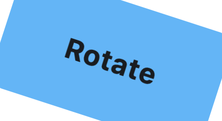
Rotate
from math import pi

import flet as ft


def main(page: ft.Page):
    page.horizontal_alignment = ft.CrossAxisAlignment.CENTER
    page.vertical_alignment = ft.MainAxisAlignment.CENTER
    page.add(
        ft.SafeArea(
            content=ft.Container(
                width=220,
                height=120,
                bgcolor=ft.Colors.BLUE_300,
                border_radius=16,
                alignment=ft.Alignment.CENTER,
                content=ft.Text("Rotate", size=28, weight=ft.FontWeight.BOLD),
                rotate=ft.Rotate(
                    angle=pi / 10,
                    alignment=ft.Alignment.CENTER,
                    filter_quality=ft.FilterQuality.MEDIUM,
                ),
            ),
        )
    )


if __name__ == "__main__":
    ft.run(main)
RotatedBox
import flet as ft


def _demo_control(content: ft.Control) -> ft.Container:
    return ft.Container(
        padding=10,
        border=ft.Border.all(1, ft.Colors.OUTLINE_VARIANT),
        border_radius=8,
        content=content,
    )


def _lane(title: str, controls: list[ft.Control]) -> ft.Container:
    return ft.Container(
        width=540,
        padding=12,
        border=ft.Border.all(1, ft.Colors.OUTLINE_VARIANT),
        border_radius=12,
        content=ft.Column(
            spacing=8,
            controls=[
                ft.Text(title, size=16, weight=ft.FontWeight.BOLD),
                ft.Divider(height=1),
                ft.Row(
                    spacing=14,
                    vertical_alignment=ft.CrossAxisAlignment.START,
                    controls=controls,
                ),
            ],
        ),
    )


def main(page: ft.Page):
    page.padding = 24
    page.scroll = ft.ScrollMode.AUTO
    page.add(
        ft.SafeArea(
            content=ft.Column(
                controls=[
                    ft.Text(
                        "RotatedBox rotates before layout. Compare occupied "
                        "space below:",
                        size=16,
                        weight=ft.FontWeight.W_500,
                    ),
                    ft.Column(
                        spacing=16,
                        controls=[
                            _lane(
                                "Normal controls",
                                [
                                    _demo_control(ft.Text("Text", size=26)),
                                    _demo_control(
                                        ft.ProgressBar(
                                            width=170, value=0.65, color=ft.Colors.GREEN
                                        )
                                    ),
                                    _demo_control(ft.Button("Button")),
                                ],
                            ),
                            _lane(
                                "RotatedBox quarter_turns=1",
                                [
                                    _demo_control(
                                        ft.RotatedBox(
                                            quarter_turns=1,
                                            content=ft.Text("Text", size=26),
                                        )
                                    ),
                                    _demo_control(
                                        ft.RotatedBox(
                                            quarter_turns=1,
                                            content=ft.ProgressBar(
                                                width=170,
                                                value=0.65,
                                                color=ft.Colors.GREEN,
                                            ),
                                        )
                                    ),
                                    _demo_control(
                                        ft.RotatedBox(
                                            quarter_turns=1,
                                            content=ft.Button("Button"),
                                        )
                                    ),
                                ],
                            ),
                        ],
                    ),
                ]
            )
        )
    )


if __name__ == "__main__":
    ft.run(main)

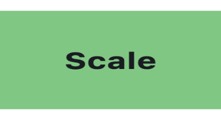
Scale
import flet as ft


def main(page: ft.Page):
    page.horizontal_alignment = ft.CrossAxisAlignment.CENTER
    page.vertical_alignment = ft.MainAxisAlignment.CENTER
    page.add(
        ft.SafeArea(
            content=ft.Container(
                width=220,
                height=120,
                bgcolor=ft.Colors.GREEN_300,
                border_radius=16,
                alignment=ft.Alignment.CENTER,
                content=ft.Text("Scale", size=28, weight=ft.FontWeight.BOLD),
                scale=ft.Scale(
                    scale_x=1.18,
                    scale_y=0.82,
                    alignment=ft.Alignment.CENTER,
                    filter_quality=ft.FilterQuality.MEDIUM,
                ),
            ),
        )
    )


if __name__ == "__main__":
    ft.run(main)
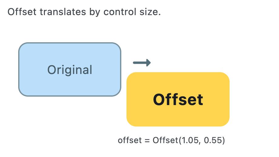
Offset
import flet as ft


def main(page: ft.Page):
    page.horizontal_alignment = ft.CrossAxisAlignment.CENTER
    page.vertical_alignment = ft.MainAxisAlignment.CENTER
    page.add(
        ft.SafeArea(
            content=ft.Stack(
                width=460,
                height=260,
                controls=[
                    ft.Text(
                        "Offset translates by control size.",
                        left=12,
                        top=8,
                        size=16,
                        color=ft.Colors.ON_SURFACE_VARIANT,
                    ),
                    ft.Container(
                        left=30,
                        top=70,
                        width=170,
                        height=90,
                        border_radius=16,
                        bgcolor=ft.Colors.BLUE_100,
                        border=ft.Border.all(2, ft.Colors.BLUE_GREY_400),
                        alignment=ft.Alignment.CENTER,
                        content=ft.Text(
                            "Original",
                            size=20,
                            color=ft.Colors.BLUE_GREY_700,
                        ),
                    ),
                    ft.Container(
                        left=30,
                        top=70,
                        width=170,
                        height=90,
                        border_radius=16,
                        bgcolor=ft.Colors.AMBER_300,
                        alignment=ft.Alignment.CENTER,
                        content=ft.Text("Offset", size=26, weight=ft.FontWeight.BOLD),
                        offset=ft.Offset(
                            x=1.05,
                            y=0.55,
                            filter_quality=ft.FilterQuality.MEDIUM,
                        ),
                    ),
                    ft.Icon(
                        ft.Icons.ARROW_RIGHT_ALT_ROUNDED,
                        left=212,
                        top=82,
                        size=44,
                        color=ft.Colors.BLUE_GREY_600,
                    ),
                    ft.Text(
                        "offset = Offset(1.05, 0.55)",
                        left=194,
                        top=222,
                        size=14,
                        color=ft.Colors.ON_SURFACE_VARIANT,
                    ),
                ],
            ),
        )
    )


if __name__ == "__main__":
    ft.run(main)
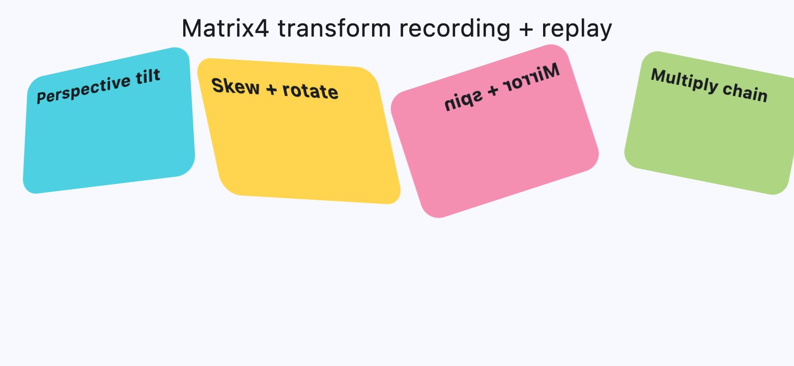
Matrix4 Transform
from math import pi

import flet as ft


def card(title: str, color: str, matrix: ft.Matrix4) -> ft.Container:
    return ft.Container(
        width=220,
        height=130,
        border_radius=18,
        bgcolor=color,
        padding=12,
        content=ft.Text(title, size=18, weight=ft.FontWeight.BOLD),
        transform=ft.Transform(
            matrix=matrix,
            alignment=ft.Alignment.CENTER,
            filter_quality=ft.FilterQuality.MEDIUM,
        ),
    )


def main(page: ft.Page):
    page.horizontal_alignment = ft.CrossAxisAlignment.CENTER
    page.scroll = ft.ScrollMode.AUTO
    page.spacing = 20

    perspective_tilt = (
        ft.Matrix4.identity()
        .set_entry(3, 2, 0.0018)
        .rotate_x(-0.35)
        .rotate_y(0.45)
        .translate(0, -10, 0)
    )

    skew_and_rotate = ft.Matrix4.skew_y(0.28).rotate_z(-pi / 14)

    mirrored_spin = ft.Matrix4.diagonal3_values(-1, 1, 1).rotate_z(pi / 10)

    mix = ft.Matrix4.translation_values(24, -8, 0).multiply(
        ft.Matrix4.rotation_z(pi / 16).scale(0.9, 0.9)
    )

    page.add(
        ft.SafeArea(
            content=ft.Column(
                spacing=20,
                horizontal_alignment=ft.CrossAxisAlignment.CENTER,
                controls=[
                    ft.Text("Matrix4 transform recording + replay", size=24),
                    ft.ResponsiveRow(
                        controls=[
                            ft.Container(
                                col={"sm": 6, "md": 3},
                                content=card(
                                    "Perspective tilt",
                                    ft.Colors.CYAN_300,
                                    perspective_tilt,
                                ),
                            ),
                            ft.Container(
                                col={"sm": 6, "md": 3},
                                content=card(
                                    "Skew + rotate",
                                    ft.Colors.AMBER_300,
                                    skew_and_rotate,
                                ),
                            ),
                            ft.Container(
                                col={"sm": 6, "md": 3},
                                content=card(
                                    "Mirror + spin",
                                    ft.Colors.PINK_200,
                                    mirrored_spin,
                                ),
                            ),
                            ft.Container(
                                col={"sm": 6, "md": 3},
                                content=card(
                                    "Multiply chain",
                                    ft.Colors.LIGHT_GREEN_300,
                                    mix,
                                ),
                            ),
                        ],
                    ),
                ],
            ),
        )
    )


if __name__ == "__main__":
    ft.run(main)
Properties
alignclass-attributeinstance-attribute
align: Alignment | None = NoneAlignment of the control within its parent.
animate_alignclass-attributeinstance-attribute
animate_align: AnimationValue | None = NoneEnables implicit animation of the LayoutControl.align property.
More information here.
animate_marginclass-attributeinstance-attribute
animate_margin: AnimationValue | None = NoneEnables implicit animation of the LayoutControl.margin property.
More information here.
animate_offsetclass-attributeinstance-attribute
animate_offset: AnimationValue | None = NoneEnables implicit animation of the LayoutControl.offset property.
More information here.
animate_opacityclass-attributeinstance-attribute
animate_opacity: AnimationValue | None = NoneEnables implicit animation of the Control.opacity property.
More information here.
animate_positionclass-attributeinstance-attribute
animate_position: AnimationValue | None = NoneEnables implicit animation of the positioning properties (LayoutControl.left, LayoutControl.right, LayoutControl.top and LayoutControl.bottom).
More information here.
animate_rotationclass-attributeinstance-attribute
animate_rotation: AnimationValue | None = NoneEnables implicit animation of the LayoutControl.rotate property.
More information here.
animate_scaleclass-attributeinstance-attribute
animate_scale: AnimationValue | None = NoneEnables implicit animation of the LayoutControl.scale property.
More information here.
animate_sizeclass-attributeinstance-attribute
animate_size: AnimationValue | None = NoneEnables implicit animation of this control's size.
If width or height is set, changes to those dimensions are
animated. If neither dimension is set, changes to the control's natural size are
animated instead.
More information here.
aspect_ratioclass-attributeinstance-attribute
aspect_ratio: Number | None = NoneThe aspect ratio of the control.
It is defined as the ratio of width to height.
In current implementation, if aspect_ratio is set, width
and height on the same control are ignored for final rendered size.
bottomclass-attributeinstance-attribute
bottom: Number | None = NoneThe distance that the child's bottom edge is inset from the bottom of the stack.
Effective only if this control is a descendant of one of the following:
Stack control, Page.overlay list.
flipclass-attributeinstance-attribute
flip: Flip | None = NoneFlips this control horizontally and/or vertically.
Set to an instance of Flip to mirror across x-axis, y-axis, or both.
heightclass-attributeinstance-attribute
height: Number | None = NoneImposed Control height in virtual pixels.
leftclass-attributeinstance-attribute
left: Number | None = NoneThe distance that the child's left edge is inset from the left of the stack.
Effective only if this control is a descendant of one of the following:
Stack control, Page.overlay list.
marginclass-attributeinstance-attribute
margin: MarginValue | None = NoneSets the margin of the control.
offsetclass-attributeinstance-attribute
offset: OffsetValue | None = NoneApplies a translation transformation before painting the control.
The translation is expressed as an Offset scaled to the control's size.
So, Offset(x=0.25, y=0), for example, will result in a horizontal translation
of one quarter the width of this control.
Example
The following example displays container at 0, 0 top left corner of a stack
as transform applies -1 * 100, -1 * 100 (offset * control's size)
horizontal and vertical translations to the control:
import flet as ft

def main(page: ft.Page):
    page.add(
        ft.Stack(
            width=1000,
            height=1000,
            controls=[
                ft.Container(
                    bgcolor=ft.Colors.RED,
                    width=100,
                    height=100,
                    left=100,
                    top=100,
                    offset=ft.Offset(-1, -1),
                )
            ],
        )
    )

ft.run(main)
rightclass-attributeinstance-attribute
right: Number | None = NoneThe distance that the child's right edge is inset from the right of the stack.
Effective only if this control is a descendant of one of the following:
Stack control, Page.overlay list.
rotateclass-attributeinstance-attribute
rotate: RotateValue | None = NoneTransforms this control using a rotation around its center.
The value of rotate property could be one of the following types:
number- a rotation in clockwise radians. Full circle360°ismath.pi * 2radians,90°ispi / 2,45°ispi / 4, etc.Rotate- allows to specify rotationangleas well asalignment- the location of rotation center.
ft.Image(
    src="https://picsum.photos/100/100",
    width=100,
    height=100,
    border_radius=5,
    rotate=Rotate(angle=0.25 * pi, alignment=ft.Alignment.CENTER_LEFT)
)
scaleclass-attributeinstance-attribute
scale: ScaleValue | None = NoneScales this control along the 2D plane. Default scale factor is 1.0, meaning no-scale.
Setting this property to 0.5, for example, makes this control twice smaller,
while 2.0 makes it twice larger.
Different scale multipliers can be specified for x and y axis, by setting
Control.scale property to an instance of Scale class.
Either scale or scale_x and scale_y could be specified, but not all of them.
ft.Image(
    src="https://picsum.photos/100/100",
    width=100,
    height=100,
    border_radius=5,
    scale=ft.Scale(scale_x=2, scale_y=0.5)
)
size_change_intervalclass-attributeinstance-attribute
size_change_interval: int = 10Sampling interval in milliseconds for on_size_change event.
Setting to 0 calls on_size_change immediately
on every change.
topclass-attributeinstance-attribute
top: Number | None = NoneThe distance that the child's top edge is inset from the top of the stack.
Effective only if this control is a descendant of one of the following:
Stack control, Page.overlay list.
Events
on_animation_endclass-attributeinstance-attribute
on_animation_end: (
    ControlEventHandler[LayoutControl] | None
) = None
Called when animation completes.
Can be used to chain multiple animations.
The data property of the event handler argument contains the name
of the animation.
More information here.
on_size_changeclass-attributeinstance-attribute
on_size_change: (
    EventHandler[LayoutSizeChangeEvent[LayoutControl]]
    | None
) = None
Called when the size of this control changes.
size_change_interval defines how often this event is called.