AppBar
A material design app bar.
Example:
ft.AppBar(
    leading=ft.Icon(ft.Icons.MENU),
    title=ft.Text("Dashboard"),
    bgcolor=ft.Colors.SURFACE_CONTAINER,
    actions=[
        ft.IconButton(ft.Icons.SEARCH),
        ft.IconButton(ft.Icons.MORE_VERT),
    ],
)

Inherits: AdaptiveControl
Properties
actions- A list ofControls to display in a row after the title control.actions_padding- The padding between theactionsand the end of this app bar.automatically_imply_leading- Whether we should try to imply theleadingcontrol if it isNone.bgcolor- The fill color to use for this app bar.center_title- Whether thetitleshould be centered.clip_behavior- The content will be clipped (or not) according to this option.color- The default color forTextandIconcontrols within this app bar.elevation- The app bar's elevation.elevation_on_scroll- The elevation to be used if this app bar has something scrolled underneath it.exclude_header_semantics- Whether thetitleshould be wrapped with headerSemantics.force_material_transparency- Forces this app bar to be transparent (instead of Material's default type).leading- A control to display before the toolbar'stitle.leading_width- Defines the width of theleadingcontrol.secondary- Whether this app bar is not being displayed at the top of the screen.shadow_color- The color of the shadow below this app bar.shape- The shape of this app bar's Material as well as its shadow.title- The primary Control displayed in this app bar.title_spacing- The spacing aroundtitleon the horizontal axis.title_text_style- The style to be used for theTextcontrols in thetitle.toolbar_height- Defines the height of the toolbar component of this app bar.toolbar_opacity- The opacity of the toolbar.toolbar_text_style- The style to be used for theTextcontrols in the app bar'sleadingandactions.
Examples
Actions and popup menu
import flet as ft


def main(page: ft.Page):
    page.title = "AppBar Example"

    def handle_checked_item_click(e: ft.Event[ft.PopupMenuItem]):
        e.control.checked = not e.control.checked

    page.appbar = ft.AppBar(
        leading=ft.Icon(ft.Icons.PALETTE),
        leading_width=40,
        title=ft.Text("AppBar Example"),
        center_title=False,
        bgcolor=ft.Colors.BLUE_GREY_400,
        actions=[
            ft.IconButton(ft.Icons.WB_SUNNY_OUTLINED),
            ft.IconButton(ft.Icons.FILTER_3),
            ft.PopupMenuButton(
                key="popup",
                items=[
                    ft.PopupMenuItem(content="Item 1"),
                    ft.PopupMenuItem(),  # divider
                    ft.PopupMenuItem(
                        content="Checked item",
                        checked=False,
                        on_click=handle_checked_item_click,
                    ),
                ],
            ),
        ],
    )
    page.add(ft.SafeArea(content=ft.Column(controls=[ft.Text("Body!")])))


if __name__ == "__main__":
    ft.run(main)
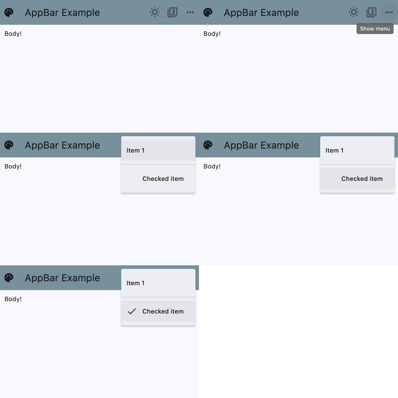
Theme mode toggle
import flet as ft

LIGHT_SEED_COLOR = ft.Colors.DEEP_ORANGE
DARK_SEED_COLOR = ft.Colors.DEEP_PURPLE


def main(page: ft.Page):
    page.title = "AppBar Example"

    def handle_checked_item_click(e: ft.Event[ft.PopupMenuItem]):
        e.control.checked = not e.control.checked

    page.theme_mode = ft.ThemeMode.LIGHT
    page.theme = ft.Theme(color_scheme_seed=LIGHT_SEED_COLOR)
    page.dark_theme = ft.Theme(color_scheme_seed=DARK_SEED_COLOR)

    def toggle_theme_mode(e: ft.Event[ft.IconButton]):
        page.theme_mode = (
            ft.ThemeMode.DARK
            if page.theme_mode == ft.ThemeMode.LIGHT
            else ft.ThemeMode.LIGHT
        )
        theme_mode_toggle.icon = (
            ft.Icons.WB_SUNNY_OUTLINED
            if page.theme_mode == ft.ThemeMode.LIGHT
            else ft.Icons.WB_SUNNY
        )

    theme_mode_toggle = ft.IconButton(
        key="theme_mode_toggle",
        icon=(
            ft.Icons.WB_SUNNY_OUTLINED
            if page.theme_mode == ft.ThemeMode.LIGHT
            else ft.Icons.WB_SUNNY
        ),
        on_click=toggle_theme_mode,
    )

    page.padding = 50
    page.appbar = ft.AppBar(
        # toolbar_height=100,
        bgcolor=ft.Colors.SECONDARY_CONTAINER,
        leading=ft.Icon(ft.Icons.PALETTE),
        leading_width=40,
        title=ft.Text("AppBar Example"),
        center_title=False,
        actions=[
            theme_mode_toggle,
            ft.PopupMenuButton(
                items=[
                    ft.PopupMenuItem(content="Item 1"),
                    ft.PopupMenuItem(icon=ft.Icons.POWER_INPUT, content="Check power"),
                    ft.PopupMenuItem(
                        on_click=lambda _: print(
                            "Button with a custom content clicked!"
                        ),
                        content=ft.Row(
                            controls=[
                                ft.Icon(ft.Icons.HOURGLASS_TOP_OUTLINED),
                                ft.Text("Item with a custom content"),
                            ]
                        ),
                    ),
                    ft.PopupMenuItem(),  # divider
                    ft.PopupMenuItem(
                        content="Checked item",
                        checked=False,
                        on_click=handle_checked_item_click,
                    ),
                ]
            ),
        ],
    )
    page.add(
        ft.SafeArea(
            content=ft.Column(
                controls=[
                    ft.Text(
                        value="Flet is a framework that allows building web, desktop "
                        "and mobile applications in Python without prior experience "
                        "in frontend development.You can build a UI for your program "
                        "with Flet controls which are based on Flutter by Google. "
                        "Flet goes beyond merely wrapping Flutter widgets. It adds "
                        "its own touch by combining smaller widgets, simplifying "
                        "complexities, implementing UI best practices, and applying "
                        "sensible defaults. This ensures that your applications look "
                        "stylish and polished without requiring additional design "
                        "efforts on your part.",
                        text_align=ft.TextAlign.END,
                    ),
                    ft.Button("Click me!"),
                ]
            )
        )
    )


if __name__ == "__main__":
    ft.run(main)
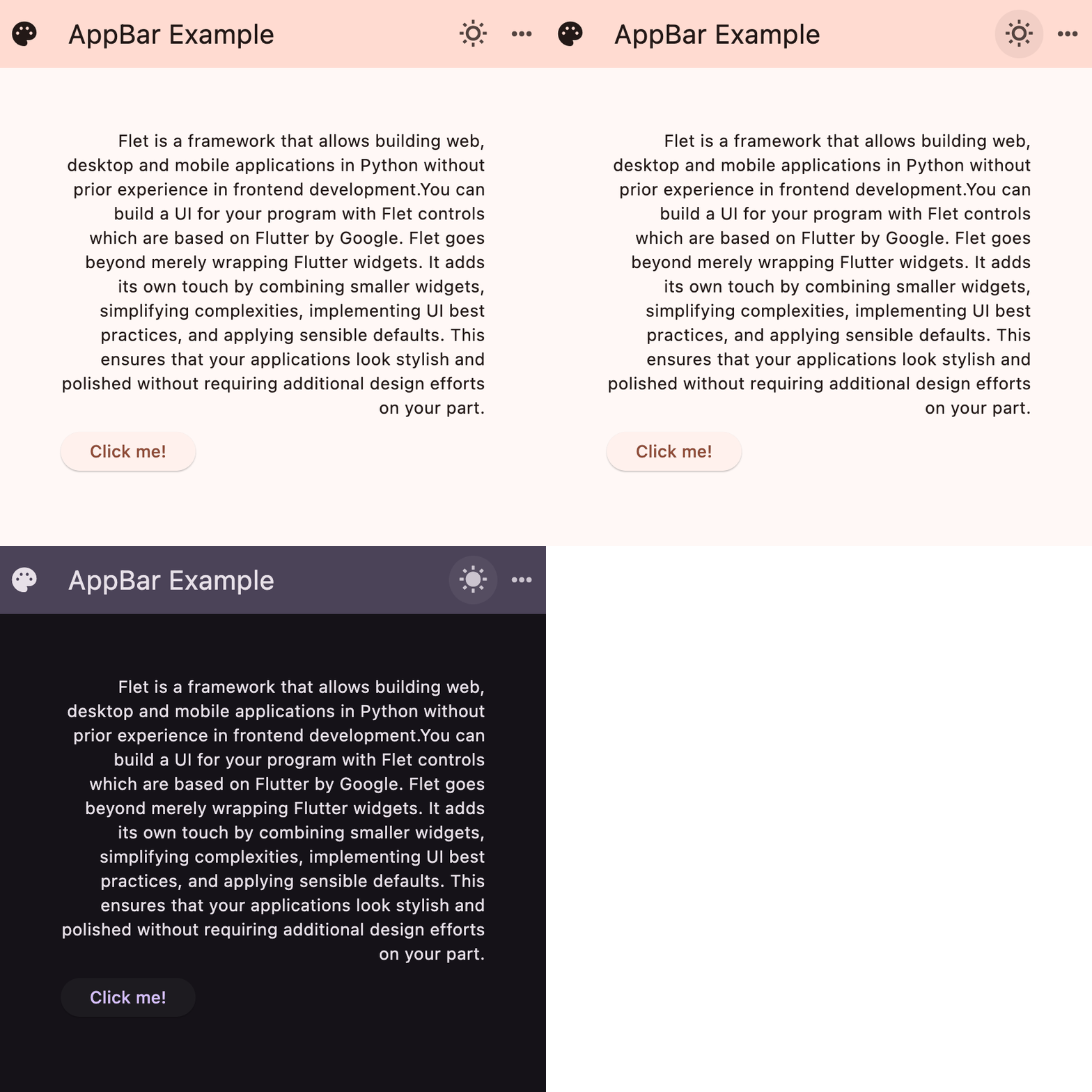
Properties
actionsclass-attributeinstance-attribute
actions: list[Control] | None = NoneA list of Controls to display in a row after the title control.
Typically, these controls are IconButtons
representing common operations. For less common operations, consider using a
PopupMenuButton as the last
action.
If AdaptiveControl.adaptive is True
and this app is opened on an iOS or macOS device,
these actions will be automatically placed in a
Row.
This is because CupertinoAppBar.trailing
(which is the counterpart property of actions) takes only a single Control.
actions_paddingclass-attributeinstance-attribute
actions_padding: PaddingValue | None = NoneThe padding between the actions and the end of this app bar.
automatically_imply_leadingclass-attributeinstance-attribute
automatically_imply_leading: bool = TrueWhether we should try to imply the leading control if it is None.
- If
TrueandleadingisNone, this app bar will automatically determine an appropriate leading control. - If
FalseandleadingisNone, the space is allocated to thetitle. - If a
leadingcontrol is provided, this parameter has no effect.
bgcolorclass-attributeinstance-attribute
bgcolor: ColorValue | None = NoneThe fill color to use for this app bar.
Default color is defined by AppBarTheme.bgcolor
center_titleclass-attributeinstance-attribute
center_title: bool | None = NoneWhether the title should be centered.
Default value is defined by AppBarTheme.center_title
clip_behaviorclass-attributeinstance-attribute
clip_behavior: ClipBehavior | None = NoneThe content will be clipped (or not) according to this option.
colorclass-attributeinstance-attribute
color: ColorValue | None = NoneThe default color for Text
and Icon controls within this app bar.
Default color is defined by AppBarTheme.color
elevationclass-attributeinstance-attribute
elevation: Number | None = NoneThe app bar's elevation.
This effect is only visible when using the Material 2 design
(when Theme.use_material3 is False).
Raises:
- ValueError - If it is not greater than or equal to
0.
elevation_on_scrollclass-attributeinstance-attribute
elevation_on_scroll: Number | None = NoneThe elevation to be used if this app bar has something scrolled underneath it.
Raises:
- ValueError - If it is not greater than or equal to
0.
exclude_header_semanticsclass-attributeinstance-attribute
exclude_header_semantics: bool = Falseforce_material_transparencyclass-attributeinstance-attribute
force_material_transparency: bool = FalseForces this app bar to be transparent (instead of Material's default type).
This will also remove the visual display of bgcolor
and elevation, and affect other characteristics of this app bar.
leadingclass-attributeinstance-attribute
leading: Control | None = NoneA control to display before the toolbar's title.
Typically an Icon or IconButton control.
leading_widthclass-attributeinstance-attribute
leading_width: Number | None = NoneDefines the width of the leading control.
secondaryclass-attributeinstance-attribute
secondary: bool = FalseWhether this app bar is not being displayed at the top of the screen.
shadow_colorclass-attributeinstance-attribute
shadow_color: ColorValue | None = NoneThe color of the shadow below this app bar.
A shadow is only visible and displayed if the elevation
is greater than zero.
shapeclass-attributeinstance-attribute
shape: OutlinedBorder | None = NoneThe shape of this app bar's Material as well as its shadow.
titleclass-attributeinstance-attribute
title: StrOrControl | None = NoneThe primary Control displayed in this app bar.
Typically a Text
control that contains a description of the current contents of this app.
If AdaptiveControl.adaptive
and this app is opened on an iOS or macOS device,
this title control will be
automatically centered, independent of the value of center_title.
title_spacingclass-attributeinstance-attribute
title_spacing: Number | None = NoneThe spacing around title on the horizontal axis.
It is applied even if there are
no leading or actions controls.
If you want title to take all the space available,
set title_spacing to 0.0.
toolbar_heightclass-attributeinstance-attribute
toolbar_height: Number | None = NoneDefines the height of the toolbar component of this app bar.