IconButton
An icon button is a round button with an icon in the middle that reacts to touches by filling with color (ink).
Icon buttons are commonly used in the toolbars, but they can be used in many other places as well.
ft.IconButton(icon=ft.Icons.FAVORITE, icon_color=ft.Colors.PRIMARY)

Inherits: LayoutControl, AdaptiveControl, ActionControl
Properties
alignment- Defines how the icon is positioned within this button.autofocus- Whether this control will be provided initial focus.bgcolor- The background color of this button.disabled_color- The color to use for the icon inside the button when disabled.enable_feedback- Whether detected gestures should provide acoustic and/or haptic feedback.focus_color- The color of this button when in focus.highlight_color- The color of this button when it is pressed.hover_color- The color of this button when hovered.icon- An icon to be shown in this button.icon_color- The foreground color of theIconButton.icon.icon_size- TheIconButton.icon's size in virtual pixels.mouse_cursor- The cursor to be displayed when a mouse pointer enters or is hovering over this control.padding- Defines the padding around this button.selected- The optional selection state of this button.selected_icon- The icon to be shown in this button for the 'selected' state.selected_icon_color- The icon color for the 'selected' state of this button.size_constraints- Size constraints for this button.splash_color- The primary color of this button when it is in the pressed state.splash_radius- The splash radius.style- Customizes this button's appearance.url- The URL to open when this button is clicked.visual_density- Defines how compact this button's layout will be.
Events
on_blur- Called when this button has lost focus.on_click- Called when a user clicks this button.on_focus- Called when this button has received focus.on_hover- Called when the button is hovered.on_long_press- Called when the button is long-pressed.
Methods
focus- Moves focus to this button.
Examples
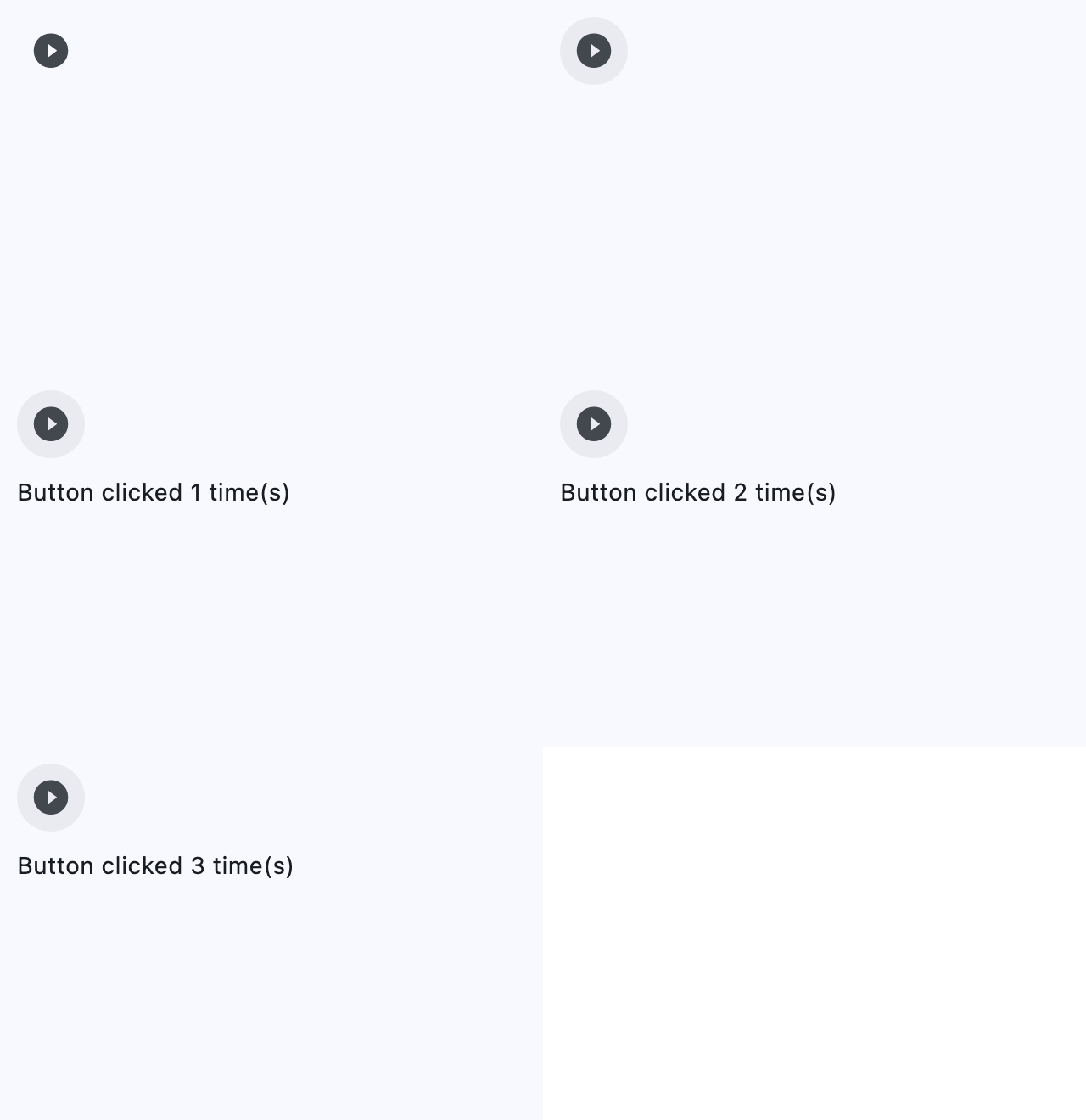
Handling clicks
import flet as ft


def main(page: ft.Page):
    page.title = "IconButton Example"

    def button_clicked(e: ft.Event[ft.IconButton]):
        button.data += 1
        message.value = f"Button clicked {button.data} time(s)"
        message.update()

    page.add(
        ft.SafeArea(
            content=ft.Column(
                controls=[
                    button := ft.IconButton(
                        key="handling_clicks_icon_button",
                        icon=ft.Icons.PLAY_CIRCLE_FILL_OUTLINED,
                        data=0,
                        on_click=button_clicked,
                    ),
                    message := ft.Text(),
                ],
            ),
        )
    )


if __name__ == "__main__":
    ft.run(main)
Selected icon
import flet as ft


def main(page: ft.Page):
    page.title = "IconButton Example"
    page.padding = 10
    page.horizontal_alignment = ft.CrossAxisAlignment.CENTER
    page.vertical_alignment = ft.MainAxisAlignment.CENTER

    def handle_click(e: ft.Event[ft.IconButton]):
        e.control.selected = not e.control.selected
        e.control.update()

    page.add(
        ft.SafeArea(
            content=ft.IconButton(
                key="selected_icon_button",
                icon=ft.Icons.BATTERY_1_BAR,
                selected_icon=ft.Icons.BATTERY_FULL,
                scale=5,
                on_click=handle_click,
                selected=False,
                style=ft.ButtonStyle(
                    color={
                        ft.ControlState.SELECTED: ft.Colors.GREEN,
                        ft.ControlState.DEFAULT: ft.Colors.RED,
                    }
                ),
            ),
        )
    )


if __name__ == "__main__":
    ft.run(main)
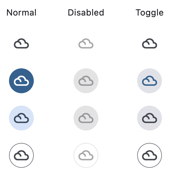
Variants
import flet as ft


def main(page: ft.Page):
    page.title = "IconButton variants"
    page.padding = 10
    page.horizontal_alignment = ft.CrossAxisAlignment.CENTER
    page.vertical_alignment = ft.MainAxisAlignment.CENTER

    def toggle_icon_button(e):
        e.control.selected = not e.control.selected

    page.add(
        ft.SafeArea(
            content=ft.Row(
                alignment=ft.MainAxisAlignment.CENTER,
                spacing=50,
                controls=[
                    # Normal buttons column (enabled only)
                    ft.Column(
                        horizontal_alignment=ft.CrossAxisAlignment.CENTER,
                        spacing=20,
                        controls=[
                            ft.Text(
                                "Normal",
                                theme_style=ft.TextThemeStyle.BODY_MEDIUM,
                            ),
                            ft.IconButton(
                                icon=ft.Icons.FILTER_DRAMA,
                            ),
                            ft.FilledIconButton(
                                icon=ft.Icons.FILTER_DRAMA,
                            ),
                            ft.FilledTonalIconButton(
                                icon=ft.Icons.FILTER_DRAMA,
                            ),
                            ft.OutlinedIconButton(
                                icon=ft.Icons.FILTER_DRAMA,
                            ),
                        ],
                    ),
                    # Disabled buttons column
                    ft.Column(
                        horizontal_alignment=ft.CrossAxisAlignment.CENTER,
                        spacing=20,
                        controls=[
                            ft.Text(
                                "Disabled",
                                theme_style=ft.TextThemeStyle.BODY_MEDIUM,
                            ),
                            ft.IconButton(
                                icon=ft.Icons.FILTER_DRAMA,
                                disabled=True,
                            ),
                            ft.FilledIconButton(
                                icon=ft.Icons.FILTER_DRAMA,
                                disabled=True,
                            ),
                            ft.FilledTonalIconButton(
                                icon=ft.Icons.FILTER_DRAMA,
                                disabled=True,
                            ),
                            ft.OutlinedIconButton(
                                icon=ft.Icons.FILTER_DRAMA,
                                disabled=True,
                            ),
                        ],
                    ),
                    # Toggle buttons column
                    ft.Column(
                        horizontal_alignment=ft.CrossAxisAlignment.CENTER,
                        spacing=20,
                        controls=[
                            ft.Text(
                                "Toggle",
                                theme_style=ft.TextThemeStyle.BODY_MEDIUM,
                            ),
                            ft.IconButton(
                                icon=ft.Icons.FILTER_DRAMA,
                                selected=False,
                                on_click=toggle_icon_button,
                            ),
                            ft.FilledIconButton(
                                icon=ft.Icons.FILTER_DRAMA,
                                selected=False,
                                on_click=toggle_icon_button,
                            ),
                            ft.FilledTonalIconButton(
                                icon=ft.Icons.FILTER_DRAMA,
                                selected=False,
                                on_click=toggle_icon_button,
                            ),
                            ft.OutlinedIconButton(
                                icon=ft.Icons.FILTER_DRAMA,
                                selected=False,
                                on_click=toggle_icon_button,
                            ),
                        ],
                    ),
                ],
            ),
        ),
    )


if __name__ == "__main__":
    ft.run(main)
Properties
alignmentclass-attributeinstance-attribute
alignment: Alignment | None = NoneDefines how the icon is positioned within this button.
Defaults to Alignment.CENTER.
autofocusclass-attributeinstance-attribute
autofocus: bool = FalseWhether this control will be provided initial focus. If there is more than one control on a page with autofocus set, then the first one added to the page will get focus.
bgcolorclass-attributeinstance-attribute
bgcolor: ColorValue | None = field(
    default=None, metadata={"skip": True}
)
The background color of this button.
disabled_colorclass-attributeinstance-attribute
disabled_color: ColorValue | None = NoneThe color to use for the icon inside the button when disabled.
enable_feedbackclass-attributeinstance-attribute
enable_feedback: bool | None = NoneWhether detected gestures should provide acoustic and/or haptic feedback.
On Android, for example, setting this to True produce a click sound and a
long-press will produce a short vibration.
focus_colorclass-attributeinstance-attribute
focus_color: ColorValue | None = NoneThe color of this button when in focus.
highlight_colorclass-attributeinstance-attribute
highlight_color: ColorValue | None = NoneThe color of this button when it is pressed. The highlight fades in quickly as this button is pressed/held down.
hover_colorclass-attributeinstance-attribute
hover_color: ColorValue | None = NoneThe color of this button when hovered.
iconclass-attributeinstance-attribute
icon: IconDataOrControl | None = NoneAn icon to be shown in this button.
icon_colorclass-attributeinstance-attribute
icon_color: ColorValue | None = NoneThe foreground color of the IconButton.icon.
icon_sizeclass-attributeinstance-attribute
icon_size: Number | None = NoneThe IconButton.icon's size in virtual pixels.
Defaults to 24.
mouse_cursorclass-attributeinstance-attribute
mouse_cursor: MouseCursor | None = field(
    default=None, metadata={"skip": True}
)
The cursor to be displayed when a mouse pointer enters or is hovering over this control.
paddingclass-attributeinstance-attribute
padding: PaddingValue | None = NoneDefines the padding around this button. The entire padded icon will react to input gestures.
Defaults to Padding.all(8).
selectedclass-attributeinstance-attribute
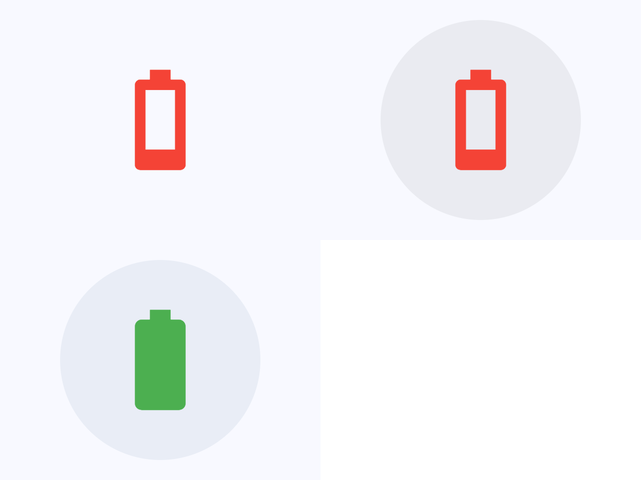
selected: bool | None = NoneThe optional selection state of this button.
If this property is not set, the button will behave as a normal push button,
otherwise, the button will toggle between showing IconButton.icon
(when False), and IconButton.selected_icon (when True).
selected_iconclass-attributeinstance-attribute
selected_icon: IconDataOrControl | None = NoneThe icon to be shown in this button for the 'selected' state.
selected_icon_colorclass-attributeinstance-attribute
selected_icon_color: ColorValue | None = NoneThe icon color for the 'selected' state of this button.
size_constraintsclass-attributeinstance-attribute
size_constraints: BoxConstraints | None = NoneSize constraints for this button.
splash_colorclass-attributeinstance-attribute
splash_color: ColorValue | None = NoneThe primary color of this button when it is in the pressed state.
splash_radiusclass-attributeinstance-attribute
splash_radius: Number | None = NoneThe splash radius.
This value is honoured only when in Material 2
(Theme.use_material3 is False).
Raises:
- ValueError - If it is not strictly greater than
0.
styleclass-attributeinstance-attribute
style: ButtonStyle | None = NoneCustomizes this button's appearance.
- Only honoured in Material 3 design (
Theme.use_material3isTrue). - If
Theme.use_material3isTrue, any parameters defined in style will be overridden by the corresponding parameters in this button. For example, if icon buttonIconButton.visual_densityis set toVisualDensity.STANDARDand style'sButtonStyle.visual_densityis set toVisualDensity.COMPACT,VisualDensity.STANDARDwill be used.
urlclass-attributeinstance-attribute
url: str | Url | None = NoneThe URL to open when this button is clicked.
Additionally, if IconButton.on_click event callback is provided,
it is fired after that.
visual_densityclass-attributeinstance-attribute
visual_density: VisualDensity | None = field(
    default=None, metadata={"skip": True}
)
Defines how compact this button's layout will be.
Events
on_blurclass-attributeinstance-attribute
on_blur: ControlEventHandler[IconButton] | None = NoneCalled when this button has lost focus.
on_clickclass-attributeinstance-attribute
on_click: ControlEventHandler[IconButton] | None = NoneCalled when a user clicks this button.
on_focusclass-attributeinstance-attribute
on_focus: ControlEventHandler[IconButton] | None = NoneCalled when this button has received focus.
on_hoverclass-attributeinstance-attribute
on_hover: ControlEventHandler[IconButton] | None = NoneCalled when the button is hovered.
on_long_pressclass-attributeinstance-attribute
on_long_press: ControlEventHandler[IconButton] | None = NoneCalled when the button is long-pressed.