Container
Allows to decorate a control with background color and border and position it with padding, margin and alignment.
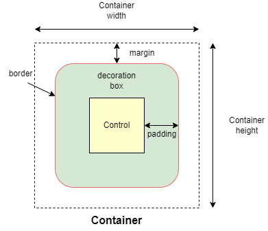
Inherits: LayoutControl, AdaptiveControl, ActionControl
Properties
alignment- Defines the alignment of thecontentinside this container.animate- Enables container "implicit" animation that gradually changes its values over a period of time.bgcolor- Defines the background color of this container.blend_mode- The blend mode applied to thecolororgradientbackground of the container.blur- Defines how Gaussian blur effect should be applied under this container.border- A border to draw above the background color.border_radius- The border radius of this container.clip_behavior- Defines how thecontentof this container is clipped.color_filter- Applies a color filter to this container.content- The content of this container.dark_theme- Allows setting a nested theme to be used when in dark theme mode for all controls inside the container and down its tree.foreground_decoration- The foreground decoration of this container.gradient- Defines the gradient background of this container.ignore_interactions- Whether to ignore all interactions with this container and its descendants.image- An image to paint above thebgcolororgradient.ink-Trueto produce ink ripples effect when user clicks this container.ink_color- The splash color of the ink response.padding- Empty space to inscribe inside a container decoration (background, border).shadow- The shadow(s) below this container.shape- Sets the shape of this container.theme- Allows setting a nested theme for all controls inside this container and down its tree.theme_mode- "Resets" parent theme and creates a new, unique scheme for all controls inside the container.url- The URL to open when this container is clicked.
Events
on_click- Called when a user clicks the container.on_hover- Called when a mouse pointer enters or exists the container area.on_long_press- Called when this container is long-pressed.on_tap_down- Called when a user clicks the container with or without a long press.
Examples
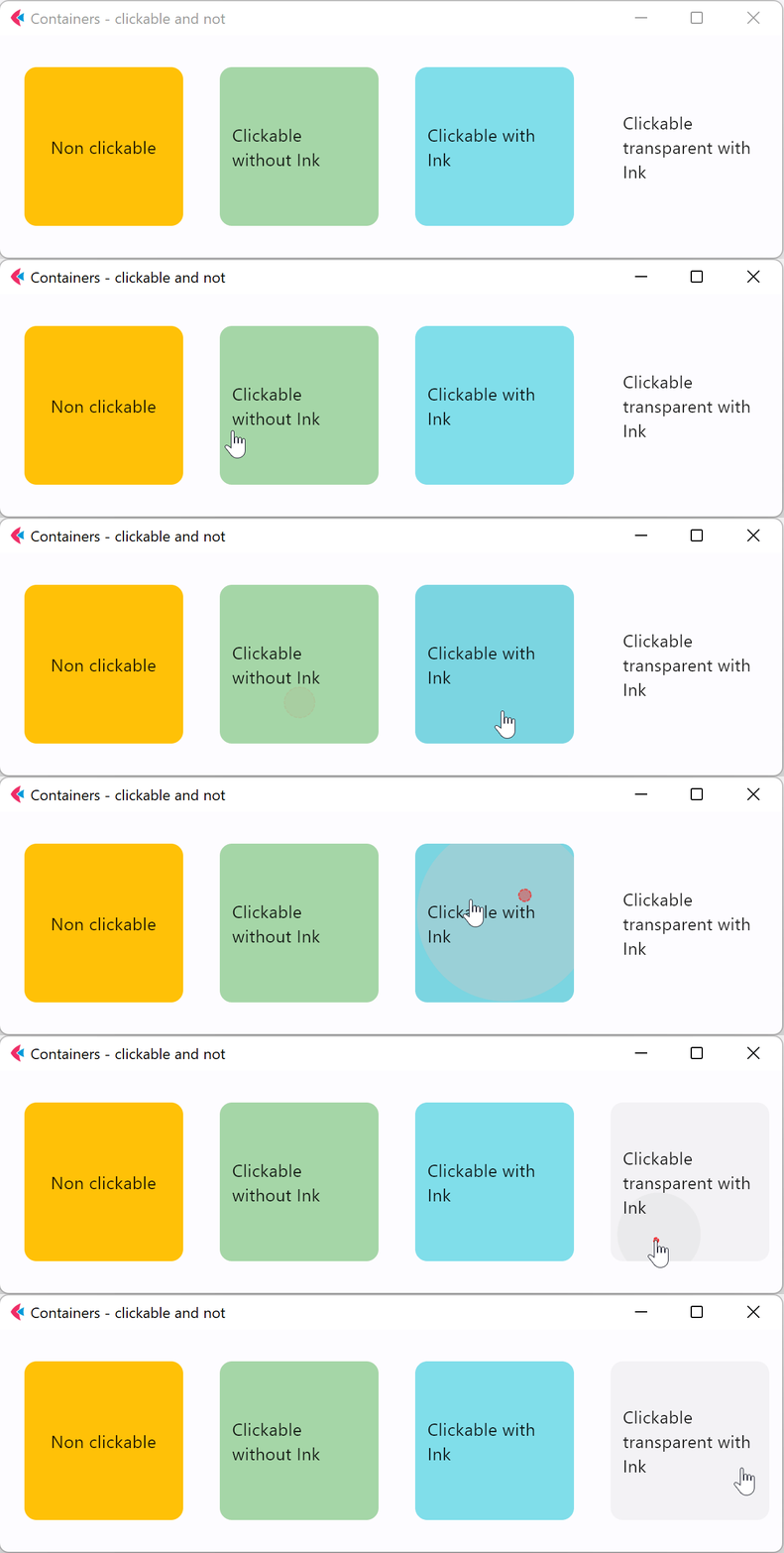
Clickable
import flet as ft


def main(page: ft.Page):
    page.title = "Container Example"
    page.theme_mode = ft.ThemeMode.LIGHT
    page.vertical_alignment = ft.MainAxisAlignment.CENTER
    page.horizontal_alignment = ft.CrossAxisAlignment.CENTER

    page.add(
        ft.SafeArea(
            content=ft.Row(
                alignment=ft.MainAxisAlignment.CENTER,
                controls=[
                    ft.Container(
                        margin=10,
                        padding=10,
                        alignment=ft.Alignment.CENTER,
                        bgcolor=ft.Colors.AMBER,
                        width=150,
                        height=150,
                        border_radius=10,
                        content=ft.Text("Non clickable"),
                    ),
                    ft.Container(
                        margin=10,
                        padding=10,
                        alignment=ft.Alignment.CENTER,
                        bgcolor=ft.Colors.GREEN_200,
                        width=150,
                        height=150,
                        border_radius=10,
                        on_click=lambda e: print("Clickable without Ink clicked!"),
                        content=ft.Text("Clickable without Ink"),
                    ),
                    ft.Container(
                        margin=10,
                        padding=10,
                        alignment=ft.Alignment.CENTER,
                        bgcolor=ft.Colors.CYAN_200,
                        width=150,
                        height=150,
                        border_radius=10,
                        ink=True,
                        on_click=lambda e: print("Clickable with Ink clicked!"),
                        content=ft.Text("Clickable with Ink"),
                    ),
                    ft.Container(
                        margin=10,
                        padding=10,
                        alignment=ft.Alignment.CENTER,
                        width=150,
                        height=150,
                        border_radius=10,
                        ink=True,
                        on_click=lambda e: print(
                            "Clickable transparent with Ink clicked!"
                        ),
                        content=ft.Text("Clickable transparent with Ink"),
                    ),
                ],
            )
        ),
    )


if __name__ == "__main__":
    ft.run(main)
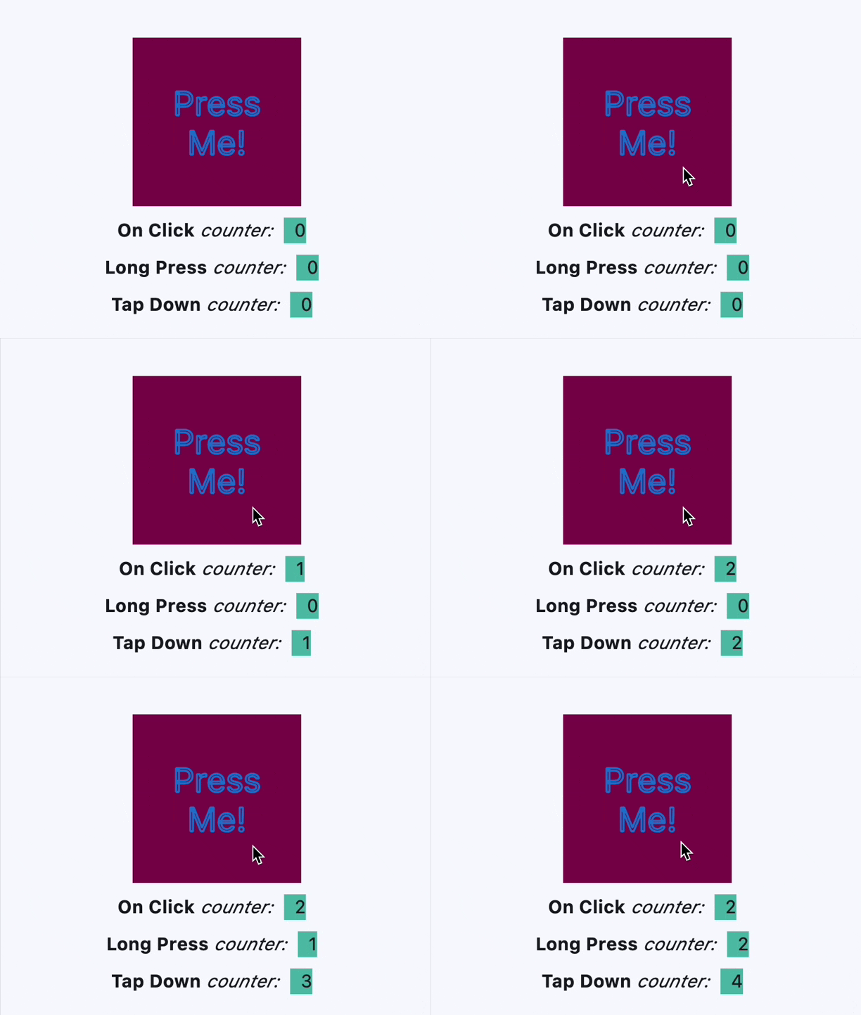
Handling clicks
import flet as ft


def main(page: ft.Page):
    page.theme_mode = ft.ThemeMode.LIGHT
    page.vertical_alignment = ft.MainAxisAlignment.CENTER
    page.horizontal_alignment = ft.CrossAxisAlignment.CENTER
    lp_counter = 0
    cl_counter = 0
    td_counter = 0

    def on_click(e):
        nonlocal cl_counter
        cl_counter += 1
        t1.spans[-1] = ft.TextSpan(
            text=f"  {cl_counter}  ",
            style=ft.TextStyle(size=16, bgcolor=ft.Colors.TEAL_300),
        )
        t1.update()

    def on_long_press(e):
        nonlocal lp_counter
        lp_counter += 1
        t3.spans[-1] = ft.TextSpan(
            text=f"  {lp_counter}  ",
            style=ft.TextStyle(size=16, bgcolor=ft.Colors.TEAL_300),
        )
        t3.update()

    def on_tap_down(e):
        nonlocal td_counter
        td_counter += 1
        t2.spans[-1] = ft.TextSpan(
            text=f"  {td_counter}  ",
            style=ft.TextStyle(size=16, bgcolor=ft.Colors.TEAL_300),
        )
        t2.update()

    c = ft.Container(
        bgcolor=ft.Colors.PINK_900,
        alignment=ft.Alignment.CENTER,
        padding=ft.Padding.all(10),
        height=150,
        width=150,
        on_click=on_click,
        on_long_press=on_long_press,
        on_tap_down=on_tap_down,
        content=ft.Text(
            "Press Me!",
            text_align=ft.TextAlign.CENTER,
            style=ft.TextStyle(
                size=30,
                # weight=ft.FontWeight.BOLD,
                foreground=ft.Paint(
                    color=ft.Colors.BLUE_700,
                    stroke_cap=ft.StrokeCap.BUTT,
                    stroke_width=2,
                    stroke_join=ft.StrokeJoin.BEVEL,
                    style=ft.PaintingStyle.STROKE,
                ),
            ),
            theme_style=ft.TextThemeStyle.DISPLAY_MEDIUM,
        ),
    )
    t1 = ft.Text(
        spans=[
            ft.TextSpan(
                text="On Click", style=ft.TextStyle(size=16, weight=ft.FontWeight.BOLD)
            ),
            ft.TextSpan(text=" counter:  ", style=ft.TextStyle(size=16, italic=True)),
            ft.TextSpan(
                text=f"  {cl_counter}  ",
                style=ft.TextStyle(size=16, bgcolor=ft.Colors.TEAL_300),
            ),
        ]
    )
    t2 = ft.Text(
        spans=[
            ft.TextSpan(
                text="Tap Down", style=ft.TextStyle(size=16, weight=ft.FontWeight.BOLD)
            ),
            ft.TextSpan(text=" counter:  ", style=ft.TextStyle(size=16, italic=True)),
            ft.TextSpan(
                text=f"  {td_counter}  ",
                style=ft.TextStyle(size=16, bgcolor=ft.Colors.TEAL_300),
            ),
        ]
    )
    t3 = ft.Text(
        spans=[
            ft.TextSpan(
                text="Long Press",
                style=ft.TextStyle(size=16, weight=ft.FontWeight.BOLD),
            ),
            ft.TextSpan(text=" counter:  ", style=ft.TextStyle(size=16, italic=True)),
            ft.TextSpan(
                text=f"  {lp_counter}  ",
                style=ft.TextStyle(size=16, bgcolor=ft.Colors.TEAL_300),
            ),
        ]
    )

    page.add(ft.SafeArea(content=ft.Column(controls=[c, t1, t3, t2])))


if __name__ == "__main__":
    ft.run(main)
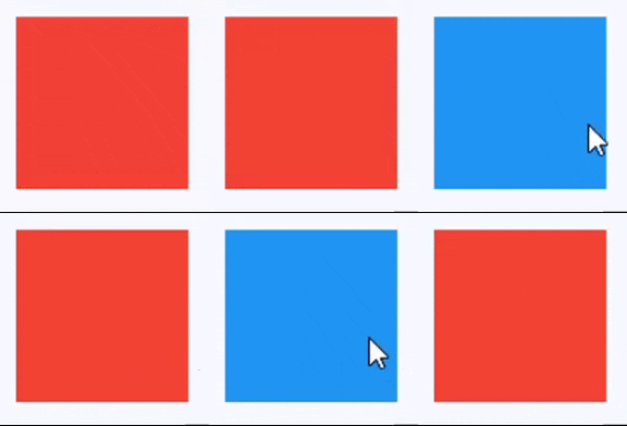
Handling hovers
import flet as ft


def main(page: ft.Page):
    def handle_hover(e: ft.Event[ft.Container]):
        e.control.bgcolor = ft.Colors.BLUE if e.data else ft.Colors.RED
        e.control.update()

    page.add(
        ft.SafeArea(
            content=ft.Container(
                width=200,
                height=200,
                bgcolor=ft.Colors.RED,
                ink=False,
                on_hover=handle_hover,
            )
        )
    )


if __name__ == "__main__":
    ft.run(main)
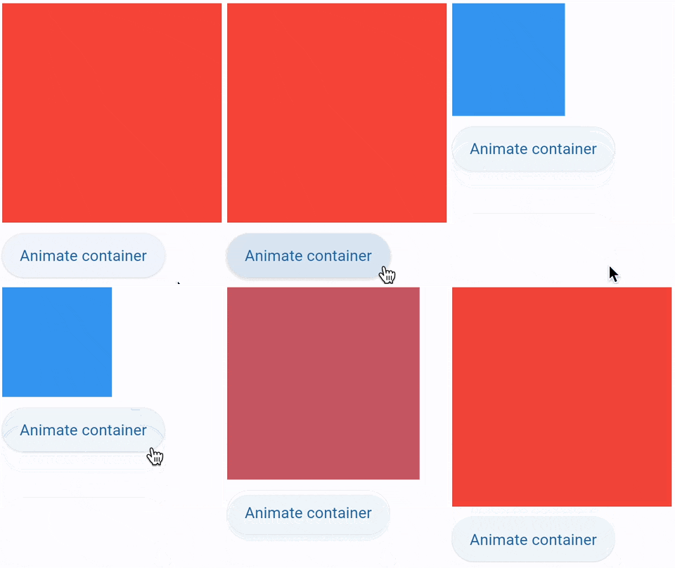
Animate size and color
import flet as ft


def main(page: ft.Page):
    def animate_container(e: ft.Event[ft.Button]):
        container.width = 100 if container.width == 150 else 150
        container.height = 50 if container.height == 150 else 150
        container.bgcolor = (
            ft.Colors.BLUE if container.bgcolor == ft.Colors.RED else ft.Colors.RED
        )
        container.update()

    page.add(
        ft.SafeArea(
            content=ft.Column(
                controls=[
                    container := ft.Container(
                        width=150,
                        height=150,
                        bgcolor=ft.Colors.RED,
                        animate=ft.Animation(
                            duration=1000, curve=ft.AnimationCurve.BOUNCE_OUT
                        ),
                    ),
                    ft.Button("Animate container", on_click=animate_container),
                ]
            )
        ),
    )


if __name__ == "__main__":
    ft.run(main)
Animate gradient and shape
import flet as ft


def main(page: ft.Page):
    gradient1 = ft.LinearGradient(
        begin=ft.Alignment.TOP_CENTER,
        end=ft.Alignment.BOTTOM_CENTER,
        colors=[ft.Colors.GREEN, ft.Colors.BLUE],
        stops=[0.5, 1.0],
    )
    gradient2 = ft.RadialGradient(
        center=ft.Alignment.TOP_LEFT,
        radius=1.0,
        colors=[ft.Colors.YELLOW, ft.Colors.DEEP_ORANGE_900],
        tile_mode=ft.GradientTileMode.CLAMP,
    )

    message = ft.Text("Animate me!")

    def animate_container(e: ft.Event[ft.Button]):
        message.value = (
            "Animate me back!" if message.value == "Animate me!" else "Animate me!"
        )
        container.width = 150 if container.width == 250 else 250
        container.height = 150 if container.height == 250 else 250
        container.gradient = gradient2 if container.gradient == gradient1 else gradient1
        if container.alignment == ft.Alignment.TOP_LEFT:
            container.alignment = ft.Alignment.BOTTOM_RIGHT
        else:
            container.alignment = ft.Alignment.TOP_LEFT
        container.border_radius = 30 if container.border_radius == 10 else 10
        container.border = (
            ft.Border.all(width=2, color=ft.Colors.BLACK)
            if container.border == ft.Border.all(width=2, color=ft.Colors.BLUE)
            else ft.Border.all(width=2, color=ft.Colors.BLUE)
        )
        container.update()

    page.add(
        ft.SafeArea(
            content=ft.Column(
                controls=[
                    container := ft.Container(
                        width=250,
                        height=250,
                        gradient=gradient2,
                        alignment=ft.Alignment.TOP_LEFT,
                        animate=ft.Animation(
                            duration=1000, curve=ft.AnimationCurve.BOUNCE_OUT
                        ),
                        border=ft.Border.all(width=2, color=ft.Colors.BLUE),
                        border_radius=10,
                        padding=10,
                        content=message,
                    ),
                    ft.Button("Animate container", on_click=animate_container),
                ]
            )
        ),
    )


if __name__ == "__main__":
    ft.run(main)
Animated slide-in menu
import flet as ft


def main(page: ft.Page):
    def show_menu(e: ft.Event[ft.Button]):
        container.offset = ft.Offset(0, 0)
        container.update()

    def hide_menu(e: ft.Event[ft.IconButton]):
        container.offset = ft.Offset(-2, 0)
        container.update()

    page.overlay.append(
        container := ft.Container(
            left=10,
            top=10,
            width=200,
            height=300,
            bgcolor=ft.Colors.SURFACE_CONTAINER_HIGHEST,
            border_radius=5,
            offset=ft.Offset(-2, 0),
            animate_offset=ft.Animation(300, ft.AnimationCurve.EASE_IN),
            content=ft.Column(
                controls=[
                    ft.Row(
                        alignment=ft.MainAxisAlignment.END,
                        controls=[
                            ft.IconButton(icon=ft.Icons.CLOSE, on_click=hide_menu)
                        ],
                    ),
                    ft.ListTile(
                        title=ft.Text("Menu A"),
                        on_click=lambda _: print("Menu A clicked"),
                    ),
                    ft.ListTile(
                        title=ft.Text("Menu B"),
                        on_click=lambda _: print("Menu B clicked"),
                    ),
                ]
            ),
        )
    )

    page.add(ft.SafeArea(content=ft.Button("Show menu", on_click=show_menu)))


if __name__ == "__main__":
    ft.run(main)
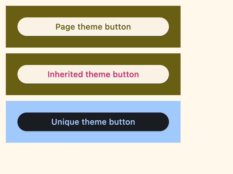
Inherited and overridden theme
import flet as ft


def main(page: ft.Page):
    # Yellow page theme with SYSTEM (default) mode
    page.theme = ft.Theme(
        color_scheme_seed=ft.Colors.YELLOW,
    )

    page.add(
        ft.SafeArea(
            content=ft.Column(
                controls=[
                    # Page theme
                    ft.Container(
                        bgcolor=ft.Colors.SURFACE_TINT,
                        padding=20,
                        width=300,
                        content=ft.Button("Page theme button"),
                    ),
                    # Inherited theme with primary color overridden
                    ft.Container(
                        theme=ft.Theme(
                            color_scheme=ft.ColorScheme(primary=ft.Colors.PINK)
                        ),
                        bgcolor=ft.Colors.SURFACE_TINT,
                        padding=20,
                        width=300,
                        content=ft.Button("Inherited theme button"),
                    ),
                    # Unique always DARK theme
                    ft.Container(
                        theme=ft.Theme(color_scheme_seed=ft.Colors.INDIGO),
                        theme_mode=ft.ThemeMode.DARK,
                        bgcolor=ft.Colors.SURFACE_TINT,
                        padding=20,
                        width=300,
                        content=ft.Button("Unique theme button"),
                    ),
                ]
            )
        ),
    )


if __name__ == "__main__":
    ft.run(main)
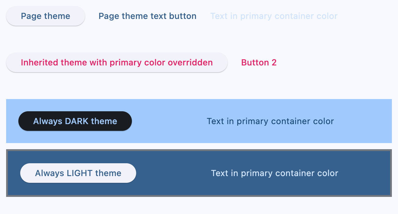
Page, dark and light themes
import flet as ft


def main(page: ft.Page):
    # page.theme = ft.Theme(
    #     color_scheme_seed=ft.Colors.YELLOW,
    #     color_scheme=ft.ColorScheme(
    #         primary=ft.Colors.GREEN, primary_container=ft.Colors.GREEN_200
    #     ),
    # )

    page.add(
        ft.SafeArea(
            content=ft.Column(
                controls=[
                    ft.Row(
                        controls=[
                            ft.Button("Page theme"),
                            ft.TextButton("Page theme text button"),
                            ft.Text(
                                "Text in primary container color",
                                color=ft.Colors.PRIMARY_CONTAINER,
                            ),
                        ]
                    ),
                    ft.Container(
                        height=100,
                        theme=ft.Theme(
                            color_scheme=ft.ColorScheme(primary=ft.Colors.PINK)
                        ),
                        content=ft.Row(
                            controls=[
                                ft.Button(
                                    "Inherited theme with primary color overridden"
                                ),
                                ft.TextButton("Button 2"),
                            ]
                        ),
                    ),
                    ft.Container(
                        padding=20,
                        bgcolor=ft.Colors.SURFACE_TINT,
                        theme_mode=ft.ThemeMode.DARK,
                        theme=ft.Theme(
                            color_scheme_seed=ft.Colors.GREEN,
                            color_scheme=ft.ColorScheme(
                                primary_container=ft.Colors.BLUE
                            ),
                        ),
                        content=ft.Row(
                            controls=[
                                ft.Button("Always DARK theme"),
                                ft.TextButton("Text button"),
                                ft.Text(
                                    "Text in primary container color",
                                    color=ft.Colors.PRIMARY_CONTAINER,
                                ),
                            ]
                        ),
                    ),
                    ft.Container(
                        padding=20,
                        bgcolor=ft.Colors.SURFACE_TINT,
                        border=ft.Border.all(3, ft.Colors.OUTLINE),
                        theme_mode=ft.ThemeMode.LIGHT,
                        theme=ft.Theme(),
                        content=ft.Row(
                            controls=[
                                ft.Button("Always LIGHT theme"),
                                ft.TextButton("Text button"),
                                ft.Text(
                                    "Text in primary container color",
                                    color=ft.Colors.PRIMARY_CONTAINER,
                                ),
                            ]
                        ),
                    ),
                ]
            )
        )
    )


if __name__ == "__main__":
    ft.run(main)
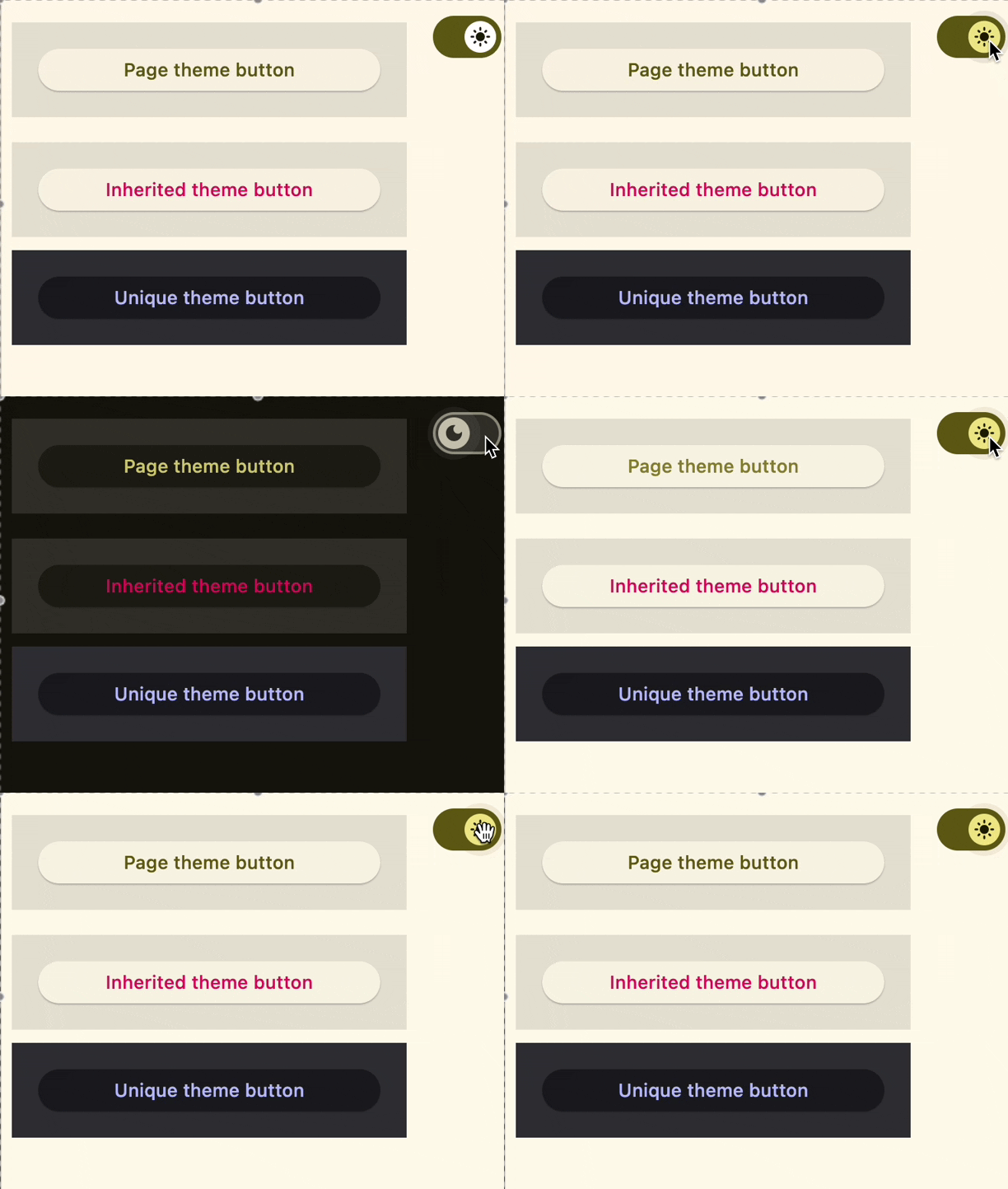
Theme mode toggle
import flet as ft


def main(page: ft.Page):
    page.theme_mode = ft.ThemeMode.DARK

    def handle_switch_change(e: ft.Event[ft.Switch]):
        if page.theme_mode == ft.ThemeMode.DARK:
            page.theme_mode = ft.ThemeMode.LIGHT
            switch.thumb_icon = ft.Icons.LIGHT_MODE
        else:
            switch.thumb_icon = ft.Icons.DARK_MODE
            page.theme_mode = ft.ThemeMode.DARK
        page.update()

    # Yellow page theme with SYSTEM (default) mode
    page.theme = ft.Theme(color_scheme_seed=ft.Colors.YELLOW)

    switch = ft.Switch(thumb_icon=ft.Icons.DARK_MODE, on_change=handle_switch_change)

    page.add(
        ft.SafeArea(
            content=ft.Column(
                controls=[
                    # Page theme
                    ft.Row(
                        alignment=ft.MainAxisAlignment.SPACE_BETWEEN,
                        controls=[
                            ft.Container(
                                bgcolor=ft.Colors.SURFACE_TINT,
                                padding=20,
                                width=300,
                                content=ft.Button("Page theme button"),
                            ),
                            ft.Container(
                                padding=ft.Padding.only(bottom=50),
                                alignment=ft.Alignment.TOP_RIGHT,
                                content=switch,
                            ),
                        ],
                    ),
                    # Inherited theme with primary color overridden
                    ft.Container(
                        theme=ft.Theme(
                            color_scheme=ft.ColorScheme(primary=ft.Colors.PINK)
                        ),
                        bgcolor=ft.Colors.SURFACE_TINT,
                        padding=20,
                        width=300,
                        content=ft.Button("Inherited theme button"),
                    ),
                    # Unique always DARK theme
                    ft.Container(
                        theme=ft.Theme(color_scheme_seed=ft.Colors.INDIGO),
                        theme_mode=ft.ThemeMode.DARK,
                        bgcolor=ft.Colors.SURFACE_TINT,
                        padding=20,
                        width=300,
                        content=ft.Button("Unique theme button"),
                    ),
                ]
            )
        ),
    )


if __name__ == "__main__":
    ft.run(main)
Size aware
import flet as ft


def main(page: ft.Page):
    def handle_size_change(e: ft.LayoutSizeChangeEvent[ft.Container]):
        e.control.content.value = f"{int(e.width)} x {int(e.height)}"

    page.add(
        ft.SafeArea(
            expand=True,
            content=ft.Container(
                expand=True,
                alignment=ft.Alignment.CENTER,
                bgcolor=ft.Colors.BLUE_ACCENT,
                size_change_interval=100,
                on_size_change=handle_size_change,
                content=ft.Text(color=ft.Colors.WHITE, weight=ft.FontWeight.BOLD),
            ),
        )
    )


if __name__ == "__main__":
    ft.run(main)
Properties
alignmentclass-attributeinstance-attribute
alignment: Alignment | None = NoneDefines the alignment of the content inside this container.
If alignment is non-None, this container may expand to fill the
available space from its parent (before positioning its content
within itself according to the given alignment) instead of shrinking to its
content. If you need this container to keep a fixed size, give it
container an explicit width and/or height values, or constrain it via
its parent.
animateclass-attributeinstance-attribute
animate: AnimationValue | None = NoneEnables container "implicit" animation that gradually changes its values over a period of time.
bgcolorclass-attributeinstance-attribute
bgcolor: ColorValue | None = NoneDefines the background color of this container.
blend_modeclass-attributeinstance-attribute
blend_mode: BlendMode | None = NoneThe blend mode applied to the color or gradient background of the container.
Defaults to BlendMode.MODULATE.
blurclass-attributeinstance-attribute
blur: BlurValue | None = NoneDefines how Gaussian blur effect should be applied under this container.
ft.Stack(
    controls=[
        ft.Container(
            content=ft.Text("Hello"),
            image_src="https://picsum.photos/100/100",
            width=100,
            height=100,
        ),
        ft.Container(
            width=50,
            height=50,
            blur=10,
            bgcolor="#44CCCC00",
        ),
        ft.Container(
            width=50,
            height=50,
            left=10,
            top=60,
            blur=(0, 10),
        ),
        ft.Container(
            top=10,
            left=60,
            blur=ft.Blur(10, 0, ft.BlurTileMode.MIRROR),
            width=50,
            height=50,
            bgcolor="#44CCCCCC",
            border=ft.Border.all(2, ft.Colors.BLACK),
        ),
    ]
)
borderclass-attributeinstance-attribute
border: Border | None = NoneA border to draw above the background color.
border_radiusclass-attributeinstance-attribute
border_radius: BorderRadiusValue | None = NoneThe border radius of this container.
clip_behaviorclass-attributeinstance-attribute
clip_behavior: ClipBehavior | None = NoneDefines how the content of this container is clipped.
Defaults to ClipBehavior.ANTI_ALIAS if border_radius is not None;
otherwise ClipBehavior.NONE.
color_filterclass-attributeinstance-attribute
color_filter: ColorFilter | None = NoneApplies a color filter to this container.
contentclass-attributeinstance-attribute
content: Control | None = NoneThe content of this container.
dark_themeclass-attributeinstance-attribute
dark_theme: Theme | None = NoneAllows setting a nested theme to be used when in dark theme mode for all controls inside the container and down its tree.
foreground_decorationclass-attributeinstance-attribute
foreground_decoration: BoxDecoration | None = NoneThe foreground decoration of this container.
gradientclass-attributeinstance-attribute
gradient: Gradient | None = NoneDefines the gradient background of this container.
ignore_interactionsclass-attributeinstance-attribute
ignore_interactions: bool = FalseWhether to ignore all interactions with this container and its descendants.
imageclass-attributeinstance-attribute
image: DecorationImage | None = NoneAn image to paint above the bgcolor or gradient. If shape=BoxShape.CIRCLE then this image is clipped to the circle's boundary; if border_radius is not None then the image is clipped to the given radii.
inkclass-attributeinstance-attribute
ink: bool = FalseTrue to produce ink ripples effect when user clicks this container.
ink_colorclass-attributeinstance-attribute
ink_color: ColorValue | None = NoneThe splash color of the ink response.
paddingclass-attributeinstance-attribute
padding: PaddingValue | None = NoneEmpty space to inscribe inside a container decoration (background, border). The child control is placed inside this padding.
shadowclass-attributeinstance-attribute
shadow: BoxShadowValue | None = NoneThe shadow(s) below this container.
shapeclass-attributeinstance-attribute
shape: BoxShape = BoxShape.RECTANGLESets the shape of this container.
themeclass-attributeinstance-attribute
theme: Theme | None = NoneAllows setting a nested theme for all controls inside this container and down its tree.
theme_modeclass-attributeinstance-attribute
theme_mode: ThemeMode | None = None"Resets" parent theme and creates a new, unique scheme for all controls inside the container. Otherwise the styles defined in container's theme property override corresponding styles from the parent, inherited theme.
Defaults to ThemeMode.SYSTEM.
Events
on_clickclass-attributeinstance-attribute
on_click: ControlEventHandler[Container] | None = NoneCalled when a user clicks the container.
It will not be called if this container is long pressed.
on_hoverclass-attributeinstance-attribute
on_hover: ControlEventHandler[Container] | None = NoneCalled when a mouse pointer enters or exists the container area.
The Event.data property of the event handler argument is a boolean:
True when the cursor enters and False when it exits this container.
on_long_pressclass-attributeinstance-attribute
on_long_press: ControlEventHandler[Container] | None = NoneCalled when this container is long-pressed.
on_tap_downclass-attributeinstance-attribute
on_tap_down: EventHandler[TapEvent[Container]] | None = NoneCalled when a user clicks the container with or without a long press.