SnackBar
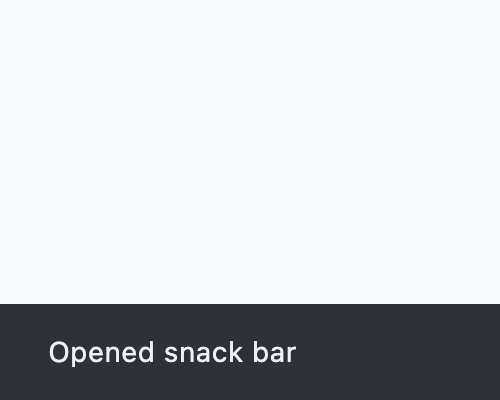
A lightweight message with an optional action which briefly displays at the bottom of the screen.
Example:
page.show_dialog(ft.SnackBar(ft.Text("Opened snack bar")))
Inherits: DialogControl
Properties
action- An optional action that the user can take based on the snack bar.action_overflow_threshold- The percentage threshold foraction's width before it overflows to a new line.behavior- This defines the behavior and location of the snack bar.bgcolor- SnackBar background color.clip_behavior- Thecontentwill be clipped (or not) according to this option.close_icon_color- The color of the close icon, ifshow_close_iconisTrue.content- The primary content of the snack bar.dismiss_direction- The direction in which the SnackBar can be dismissed.duration- The amount of time this snack bar should stay open for.elevation- The z-coordinate at which to place the snack bar.margin- Empty space to surround the snack bar.padding- The amount of padding to apply to the snack bar's content and optional action.persist- Whether the snack bar will stay or auto-dismiss after timeout.shape- The shape of this snack bar.show_close_icon- Whether to include a "close" icon widget.width- The width of the snack bar.
Events
on_action- Called when action button is clicked.on_visible- Called the first time that the snackbar is visible within the page.
Examples
SnackBar
import flet as ft


def main(page: ft.Page):
    def on_click(e: ft.Event[ft.Button]):
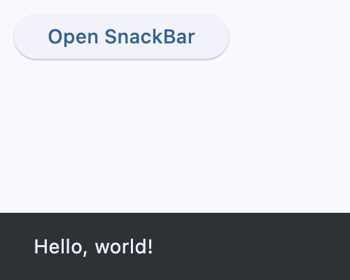
        page.show_dialog(ft.SnackBar(ft.Text("Hello, world!")))

    page.add(ft.SafeArea(content=ft.Button("Open SnackBar", on_click=on_click)))


if __name__ == "__main__":
    ft.run(main)
SnackBar counter
import flet as ft


class Data:
    def __init__(self) -> None:
        self.counter = 0

    def increment(self):
        self.counter += 1

    def decrement(self):
        self.counter -= 1


data = Data()


def main(page: ft.Page):
    page.title = "SnackBar Example"

    snack_bar = ft.SnackBar(
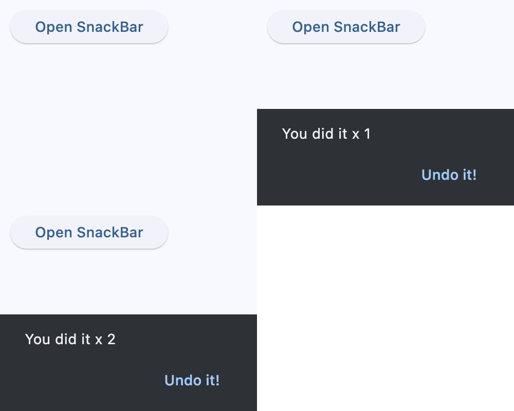
        content=ft.Text("You did it!"),
        action="Undo it!",
        on_action=lambda e: data.decrement(),
    )

    def handle_button_click(e: ft.Event[ft.Button]):
        data.increment()
        snack_bar.content.value = f"You did it x {data.counter}"
        if not snack_bar.open:
            page.show_dialog(snack_bar)
        page.update()

    page.add(
        ft.SafeArea(content=ft.Button("Open SnackBar", on_click=handle_button_click))
    )


if __name__ == "__main__":
    ft.run(main)
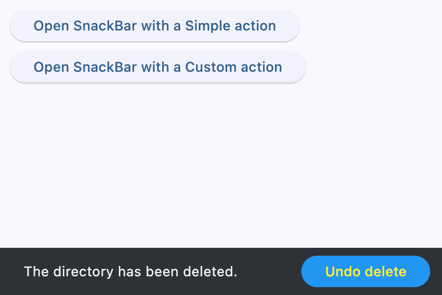
SnackBar action
import flet as ft


def main(page: ft.Page):
    def open_simple_action(e: ft.Event[ft.Button]):
        page.show_dialog(
            ft.SnackBar(
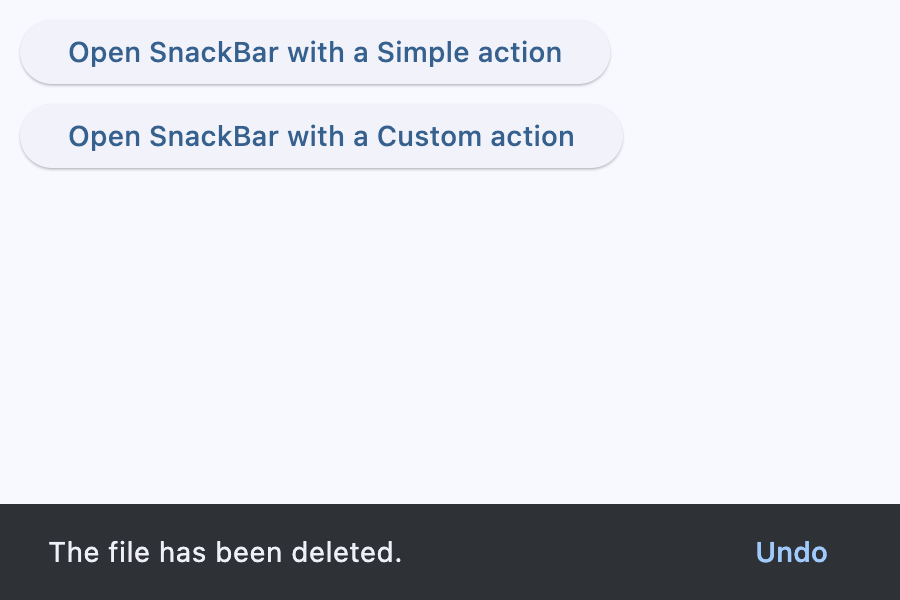
                ft.Text("The file has been deleted."),
                action="Undo",
                on_action=lambda e: print("Simple Undo clicked"),
            )
        )

    def open_custom_action(e: ft.Event[ft.Button]):
        page.show_dialog(
            ft.SnackBar(
                ft.Text("The directory has been deleted."),
                persist=False,
                action=ft.SnackBarAction(
                    label="Undo delete",
                    text_color=ft.Colors.YELLOW,
                    bgcolor=ft.Colors.BLUE,
                    on_click=lambda e: print("Custom Undo clicked"),
                ),
            )
        )

    page.add(
        ft.SafeArea(
            content=ft.Column(
                controls=[
                    ft.Button(
                        "Open SnackBar with a Simple action",
                        on_click=open_simple_action,
                    ),
                    ft.Button(
                        "Open SnackBar with a Custom action",
                        on_click=open_custom_action,
                    ),
                ]
            )
        )
    )


if __name__ == "__main__":
    ft.run(main)
Properties
actionclass-attributeinstance-attribute
action: str | SnackBarAction | None = NoneAn optional action that the user can take based on the snack bar.
For example, the snack bar might let the user undo the operation that prompted the snackbar. Snack bars can have at most one action.
The action should not be "dismiss" or "cancel".
action_overflow_thresholdclass-attributeinstance-attribute
action_overflow_threshold: Number | None = 0.25The percentage threshold for action's width before it overflows to a new line.
If the width of the snackbar's content is greater than this percentage
of the width of the snackbar minus the width of its action, then the action
will appear below the content.
At a value of 0.0, the action will not overflow to a new line.
Raises:
- ValueError - If it is not between
0.0and1.0, inclusive.
behaviorclass-attributeinstance-attribute
behavior: SnackBarBehavior | None = NoneThis defines the behavior and location of the snack bar.
Defines where a SnackBar should appear within a page and how its location
should be adjusted when the page also includes a FloatingActionButton
or a NavigationBar.
If None, SnackBarTheme.behavior is used.
If that's is also None, defaults to SnackBarBehavior.FIXED.
- If
behaviorisSnackBarBehavior.FLOATING, the length of the bar is defined by eitherwidthandmargin, and if both are specified,widthtakes precedence overmargin. widthandmarginare ignored ifbehavioris notSnackBarBehavior.FLOATING.
bgcolorclass-attributeinstance-attribute
bgcolor: ColorValue | None = NoneSnackBar background color.
clip_behaviorclass-attributeinstance-attribute
clip_behavior: ClipBehavior = ClipBehavior.HARD_EDGEThe content will be clipped (or not) according to this option.
close_icon_colorclass-attributeinstance-attribute
close_icon_color: ColorValue | None = NoneThe color of the close icon, if show_close_icon is True.
contentinstance-attribute
content: StrOrControlThe primary content of the snack bar.
Typically a Text control.
Raises:
- ValueError - If it is neither a string nor a visible
Control.
dismiss_directionclass-attributeinstance-attribute
dismiss_direction: DismissDirection | None = NoneThe direction in which the SnackBar can be dismissed.
If None, SnackBarTheme.dismiss_direction is used.
If that's is also None, defaults to DismissDirection.DOWN.
durationclass-attributeinstance-attribute
duration: DurationValue = field(
    default_factory=lambda: Duration(milliseconds=4000)
)
The amount of time this snack bar should stay open for.
elevationclass-attributeinstance-attribute
elevation: Number | None = NoneThe z-coordinate at which to place the snack bar. This controls the size of the shadow below the snack bar.
Raises:
- ValueError - If it is not greater than or equal to
0.
marginclass-attributeinstance-attribute
margin: MarginValue | None = NoneEmpty space to surround the snack bar.
Has effect only when behavior=SnackBarBehavior.FLOATING and will be ignored
if width is specified.
paddingclass-attributeinstance-attribute
padding: PaddingValue | None = NoneThe amount of padding to apply to the snack bar's content and optional action.
persistclass-attributeinstance-attribute
persist: bool | None = NoneWhether the snack bar will stay or auto-dismiss after timeout.
If True, the snack bar remains visible even after the timeout,
until the user taps the action button or the close icon.
If False, the snack bar will be dismissed after the timeout.
If not provided, but the snackbar action is not null,
the snackbar will persist as well.
shapeclass-attributeinstance-attribute
shape: OutlinedBorder | None = NoneThe shape of this snack bar.
show_close_iconclass-attributeinstance-attribute
show_close_icon: bool = FalseWhether to include a "close" icon widget.
Tapping the icon will close the snack bar.
widthclass-attributeinstance-attribute
width: Number | None = NoneThe width of the snack bar.
If width is specified, the snack bar will be centered horizontally in the available space.
Has effect only when behavior is SnackBarBehavior.FLOATING.
It can not be used if margin is specified.
Events
on_actionclass-attributeinstance-attribute
on_action: ControlEventHandler[SnackBar] | None = NoneCalled when action button is clicked.
on_visibleclass-attributeinstance-attribute
on_visible: ControlEventHandler[SnackBar] | None = NoneCalled the first time that the snackbar is visible within the page.
A button that can be used as an action in a SnackBar.
An action button for a SnackBar.
- Snack bar actions are always enabled. Instead of disabling a snack bar action, avoid including it in the snack bar in the first place.
- Snack bar actions will only respond to first click. Subsequent clicks/presses are ignored.
Inherits: Control
Properties
bgcolor- The button background fill color.disabled_bgcolor- The button disabled background color.disabled_text_color- The button disabled label color.label- The button's label.text_color- The button label color.
Events
on_click- Called when this action button is clicked.
Properties
bgcolorclass-attributeinstance-attribute
bgcolor: ColorValue | None = NoneThe button background fill color.
If None, SnackBarTheme.action_bgcolor is used.
disabled_bgcolorclass-attributeinstance-attribute
disabled_bgcolor: ColorValue | None = NoneThe button disabled background color. This color is shown after the action is dismissed.
If None, SnackBarTheme.disabled_action_bgcolor is used.
disabled_text_colorclass-attributeinstance-attribute
disabled_text_color: ColorValue | None = NoneThe button disabled label color. This color is shown after the action is dismissed.
text_colorclass-attributeinstance-attribute
text_color: ColorValue | None = NoneThe button label color.
If None, SnackBarTheme.action_text_color is used.
Events
on_clickclass-attributeinstance-attribute
on_click: ControlEventHandler[SnackBarAction] | None = NoneCalled when this action button is clicked.