NavigationRail
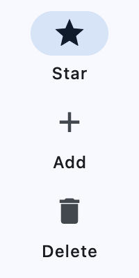
A material widget that is meant to be displayed at the left or right of an app to navigate between a small number of views, typically between three and five.
Example:
ft.NavigationRail(
    selected_index=0,
    height=200,
    width=100,
    destinations=[
        ft.NavigationRailDestination(icon=ft.Icons.STAR, label="Star"),
        ft.NavigationRailDestination(icon=ft.Icon(ft.Icons.ADD),label="Add"),
        ft.NavigationRailDestination(icon=ft.Icons.DELETE, label=ft.Text("Delete")
    ],
)
Inherits: LayoutControl
Properties
bgcolor- Sets the color of the Container that holds all of this NavigationRail's contents.destinations- Defines the appearance of the button items that are arrayed within the navigation rail.elevation- Controls the size of the shadow below the NavigationRail.extended- Indicates that the NavigationRail should be in the extended state.group_alignment- The vertical alignment for the group of destinations within the rail.indicator_color- The color of the navigation rail's indicator.indicator_shape- The shape of the navigation rail's indicator.label_type- Defines the layout and behavior of the labels for the default, unextended navigation rail.leading- An optional leading control in the rail that is placed above the destinations.min_extended_width- The final width when the animation is complete for settingextendedtoTrue.min_width- The smallest possible width for the rail regardless of the destination's icon or label size.pin_leading_to_top- Whether to pin theleadingcontrol to the top of the rail.pin_trailing_to_bottom- Whether to pin thetrailingcontrol to the bottom of the rail.scrollable- Whether the main group ofdestinationsshould become scrollable when vertical space is insufficient.selected_index- The index intodestinationsfor the current selectedNavigationRailDestinationorNoneif no destination is selected.selected_label_text_style- TheTextStyleof a destination's label when it is selected.trailing- An optional trailing control in the rail that is placed below the destinations.unselected_label_text_style- TheTextStyleof a destination's label when it is not selected.use_indicator- Whether to add a rounded navigation indicator behind the selected destination's icon.
Events
on_change- Called when selected destination changed.
Examples
NavigationRail
import flet as ft


def main(page: ft.Page):
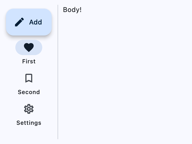
    rail = ft.NavigationRail(
        selected_index=0,
        label_type=ft.NavigationRailLabelType.ALL,
        min_width=100,
        min_extended_width=400,
        group_alignment=-0.9,
        on_change=lambda e: print("Selected destination:", e.control.selected_index),
        leading=ft.FloatingActionButton(
            icon=ft.Icons.CREATE,
            content="Add",
            on_click=lambda e: print("FAB clicked!"),
        ),
        destinations=[
            ft.NavigationRailDestination(
                icon=ft.Icons.FAVORITE_BORDER,
                selected_icon=ft.Icons.FAVORITE,
                label="First",
            ),
            ft.NavigationRailDestination(
                icon=ft.Icon(ft.Icons.BOOKMARK_BORDER),
                selected_icon=ft.Icon(ft.Icons.BOOKMARK),
                label="Second",
            ),
            ft.NavigationRailDestination(
                icon=ft.Icons.SETTINGS_OUTLINED,
                selected_icon=ft.Icon(ft.Icons.SETTINGS),
                label=ft.Text("Settings"),
            ),
        ],
    )

    page.add(
        ft.SafeArea(
            expand=True,
            content=ft.Row(
                expand=True,
                controls=[
                    ft.SelectionArea(content=rail),
                    ft.VerticalDivider(width=1),
                    ft.Column(
                        alignment=ft.MainAxisAlignment.START,
                        expand=True,
                        controls=[ft.Text("Body!")],
                    ),
                ],
            ),
        )
    )


if __name__ == "__main__":
    ft.run(main)
Adaptive Navigation
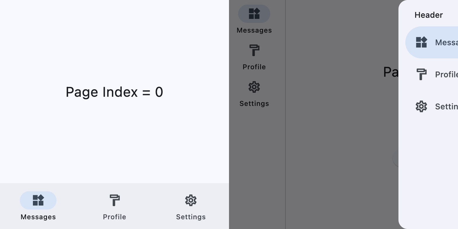
This example switches between a NavigationBar on narrow layouts and a NavigationRail with an end NavigationDrawer on wider layouts.
import flet as ft

DESTINATIONS = [
    ("Messages", ft.Icons.WIDGETS_OUTLINED, ft.Icons.WIDGETS),
    ("Profile", ft.Icons.FORMAT_PAINT_OUTLINED, ft.Icons.FORMAT_PAINT),
    ("Settings", ft.Icons.SETTINGS_OUTLINED, ft.Icons.SETTINGS),
]


def main(page: ft.Page):
    page.theme_mode = ft.ThemeMode.LIGHT
    page.padding = 0

    screen_index = 0

    def build_page_index_text() -> ft.Text:
        return ft.Text(f"Page Index = {screen_index}", size=24)

    def set_screen(index: int):
        nonlocal screen_index
        screen_index = index
        render()

    def build_navigation_bar() -> ft.NavigationBar:
        def handle_nav_bar_change(e: ft.Event[ft.NavigationBar]):
            set_screen(e.control.selected_index)

        return ft.NavigationBar(
            selected_index=screen_index,
            on_change=handle_nav_bar_change,
            destinations=[
                ft.NavigationBarDestination(
                    label=label,
                    icon=icon,
                    selected_icon=selected_icon,
                )
                for label, icon, selected_icon in DESTINATIONS
            ],
        )

    def build_navigation_rail() -> ft.NavigationRail:
        def handle_nav_rail_change(e: ft.Event[ft.NavigationRail]):
            if e.control.selected_index is not None:
                set_screen(e.control.selected_index)

        return ft.NavigationRail(
            min_width=50,
            selected_index=screen_index,
            use_indicator=True,
            on_change=handle_nav_rail_change,
            destinations=[
                ft.NavigationRailDestination(
                    label=label,
                    icon=icon,
                    selected_icon=selected_icon,
                )
                for label, icon, selected_icon in DESTINATIONS
            ],
        )

    def build_end_drawer() -> ft.NavigationDrawer:
        async def handle_drawer_change(e: ft.Event[ft.NavigationDrawer]):
            set_screen(e.control.selected_index)
            await page.close_end_drawer()

        return ft.NavigationDrawer(
            selected_index=screen_index,
            on_change=handle_drawer_change,
            controls=[
                ft.Container(
                    padding=ft.Padding.only(left=28, top=16, right=16, bottom=10),
                    content=ft.Text(
                        "Header", theme_style=ft.TextThemeStyle.TITLE_SMALL
                    ),
                ),
                *[
                    ft.NavigationDrawerDestination(
                        label=label,
                        icon=icon,
                        selected_icon=selected_icon,
                    )
                    for label, icon, selected_icon in DESTINATIONS
                ],
            ],
        )

    def build_bottom_bar_layout() -> ft.SafeArea:
        return ft.SafeArea(
            expand=True,
            content=ft.Container(
                expand=True,
                alignment=ft.Alignment.CENTER,
                content=build_page_index_text(),
            ),
        )

    def build_drawer_layout() -> ft.SafeArea:
        async def open_drawer(e: ft.Event[ft.Button]):
            await page.show_end_drawer()

        return ft.SafeArea(
            expand=True,
            avoid_intrusions_top=False,
            avoid_intrusions_bottom=False,
            content=ft.Row(
                expand=True,
                controls=[
                    ft.Container(
                        padding=ft.Padding.symmetric(horizontal=5),
                        content=build_navigation_rail(),
                    ),
                    ft.VerticalDivider(thickness=1, width=1),
                    ft.Column(
                        expand=True,
                        alignment=ft.MainAxisAlignment.SPACE_EVENLY,
                        horizontal_alignment=ft.CrossAxisAlignment.CENTER,
                        controls=[
                            build_page_index_text(),
                            ft.Button("Open Drawer", on_click=open_drawer),
                        ],
                    ),
                ],
            ),
        )

    def render():
        page.clean()
        if (page.width or page.window.width) >= 450:  # wide layout
            page.navigation_bar = None
            page.end_drawer = build_end_drawer()
            page.add(build_drawer_layout())
        else:  # narrow layout
            page.end_drawer = None
            page.navigation_bar = build_navigation_bar()
            page.add(build_bottom_bar_layout())
        page.update()

    page.on_resize = lambda e: render()
    render()


if __name__ == "__main__":
    ft.run(main)
Properties
bgcolorclass-attributeinstance-attribute
bgcolor: ColorValue | None = NoneSets the color of the Container that holds all of this NavigationRail's contents.
destinationsclass-attributeinstance-attribute
destinations: list[NavigationRailDestination] = field(
    default_factory=list
)
Defines the appearance of the button items that are arrayed within the navigation rail.
The value must be a list of two or more NavigationRailDestination instances.
elevationclass-attributeinstance-attribute
elevation: Number | None = NoneControls the size of the shadow below the NavigationRail.
Defaults to 0.0.
Raises:
- ValueError - If it is not greater than or equal to
0.
extendedclass-attributeinstance-attribute
extended: bool = FalseIndicates that the NavigationRail should be in the extended state.
The extended state has a wider rail container, and the labels are positioned next to
the icons. min_extended_width can be used to set the minimum width of the rail
when it is in this state.
The rail will implicitly animate between the extended and normal state.
If the rail is going to be in the extended state, then
label_type should be set to NavigationRailLabelType.NONE
group_alignmentclass-attributeinstance-attribute
group_alignment: Number | None = NoneThe vertical alignment for the group of destinations within the rail.
The NavigationRailDestinations are grouped together with the trailing widget, between the leading widget and the bottom of the rail.
The value must be between -1.0 and 1.0.
If group_alignment is -1.0, then the items are aligned to the top. If
group_alignment is 0.0, then the items are aligned to the center. If
group_alignment is 1.0, then the items are aligned to the bottom.
Defaults to -1.0.
indicator_colorclass-attributeinstance-attribute
indicator_color: ColorValue | None = NoneThe color of the navigation rail's indicator.
indicator_shapeclass-attributeinstance-attribute
indicator_shape: OutlinedBorder | None = NoneThe shape of the navigation rail's indicator.
Defaults to StadiumBorder.
label_typeclass-attributeinstance-attribute
label_type: NavigationRailLabelType | None = NoneDefines the layout and behavior of the labels for the default, unextended navigation rail.
When a navigation rail is extended, the labels are always shown.
Defaults to None - no labels are shown.
leadingclass-attributeinstance-attribute
leading: Control | None = NoneAn optional leading control in the rail that is placed above the destinations.
Its location is not affected by group_alignment.
Typically a FloatingActionButton, but
may also be a non-button, such as a logo.
min_extended_widthclass-attributeinstance-attribute
min_extended_width: Number | None = NoneThe final width when the animation is complete for setting extended to True.
Defaults to 256.
Raises:
- ValueError - If it is not greater than or equal to
0.
min_widthclass-attributeinstance-attribute
min_width: Number | None = NoneThe smallest possible width for the rail regardless of the destination's icon or label size.
Defaults to 72.
This value also defines the min width and min height of the destinations.
To make a compact rail, set this to 56 and set
label_type to NavigationRailLabelType.NONE
Raises:
- ValueError - If it is not greater than or equal to
0.
pin_leading_to_topclass-attributeinstance-attribute
pin_leading_to_top: bool = TrueWhether to pin the leading control to the top of the rail.
If False, the leading control becomes part of the main group together with the
destinations and participates in scrolling/alignment.
pin_trailing_to_bottomclass-attributeinstance-attribute
pin_trailing_to_bottom: bool = FalseWhether to pin the trailing control to the bottom of the rail.
If False, the trailing control becomes part of the main group together with the
destinations and participates in scrolling/alignment.
scrollableclass-attributeinstance-attribute
scrollable: bool = FalseWhether the main group of destinations should become scrollable when vertical space is insufficient.
When pin_leading_to_top or pin_trailing_to_bottom are
False, the respective controls also become part of the scrollable group.
selected_indexclass-attributeinstance-attribute
selected_index: int | None = NoneThe index into destinations for the current selected NavigationRailDestination or None if no destination is selected.
selected_label_text_styleclass-attributeinstance-attribute
selected_label_text_style: TextStyle | None = NoneThe TextStyle of a destination's label when it is selected.
When a destination is not selected, unselected_label_text_style will instead be
used.
trailingclass-attributeinstance-attribute
trailing: Control | None = NoneAn optional trailing control in the rail that is placed below the destinations.
Its location is affected by group_alignment.
This is commonly a list of additional options or destinations that is usually only
rendered when extended=True.
unselected_label_text_styleclass-attributeinstance-attribute
unselected_label_text_style: TextStyle | None = NoneThe TextStyle of a destination's label when it is not selected.
When a destination is selected, selected_label_text_style will instead be used.
use_indicatorclass-attributeinstance-attribute
use_indicator: bool | None = NoneWhether to add a rounded navigation indicator behind the selected destination's icon.
The indicator's shape will be circular if label_type
is NavigationRailLabelType.NONE, or a
StadiumBorder if label_type
is NavigationRailLabelType.ALL or
NavigationRailLabelType.SELECTED.
If None, defaults to
NavigationRailTheme.use_indicator.
If that is also None, defaults to Theme.use_material3.
Events
on_changeclass-attributeinstance-attribute
on_change: ControlEventHandler[NavigationRail] | None = NoneCalled when selected destination changed.