NavigationBar
Material 3 Navigation Bar component.
Navigation bars offer a persistent and convenient way to switch between primary destinations in an app.
ft.NavigationBar(
    destinations=[
        ft.NavigationBarDestination(icon=ft.Icons.CIRCLE, label="Item 1"),
        ft.NavigationBarDestination(icon=ft.Icons.SQUARE, label="Item 2"),
        ft.NavigationBarDestination(icon=ft.Icons.HEXAGON, label="Item 3"),
    ],
)
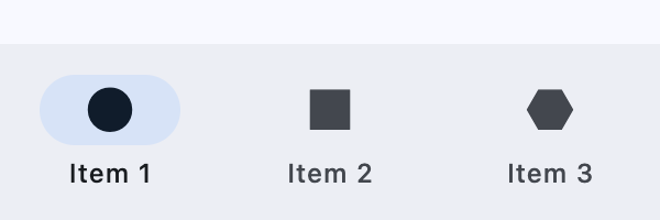
Inherits: LayoutControl, AdaptiveControl
Properties
animation_duration- The transition time for each destination as it goes between selected and unselected.bgcolor- The color of the navigation bar itself.border- The border of the adaptive navigation bar.destinations- Defines the appearance of the button items that are arrayed within the navigation bar.elevation- The elevation of the navigation bar itself.indicator_color- The color of the selected destination indicator.indicator_shape- The shape of the selected destination indicator.label_behavior- Defines how the destinations' labels will be laid out and when they'll be displayed.label_padding- The padding around theNavigationBarDestination.label.overlay_color- The highlight color of theNavigationBarDestinationin variousControlStatestates.selected_index- The index intodestinationsfor the current selectedNavigationBarDestinationorNoneif no destination is selected.shadow_color- The color used for the drop shadow to indicateelevation.
Events
on_change- Called when selected destination changed.
Examples
NavigationBar
import flet as ft


def main(page: ft.Page):
    page.title = "NavigationBar Example"

    page.navigation_bar = ft.NavigationBar(
        destinations=[
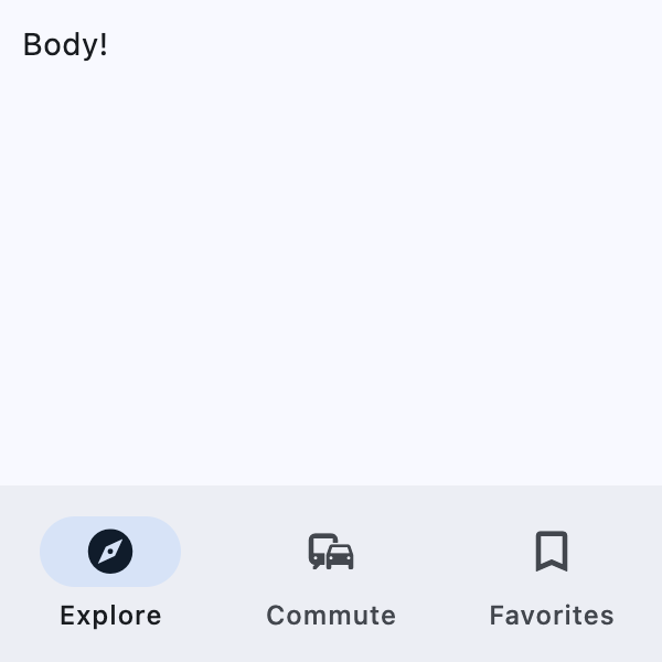
            ft.NavigationBarDestination(icon=ft.Icons.EXPLORE, label="Explore"),
            ft.NavigationBarDestination(icon=ft.Icons.COMMUTE, label="Commute"),
            ft.NavigationBarDestination(
                icon=ft.Icons.BOOKMARK_BORDER,
                selected_icon=ft.Icons.BOOKMARK,
                label="Favorites",
            ),
        ]
    )

    page.add(
        ft.SafeArea(
            content=ft.Text("Body!"),
        )
    )


if __name__ == "__main__":
    ft.run(main)
Adaptive Navigation
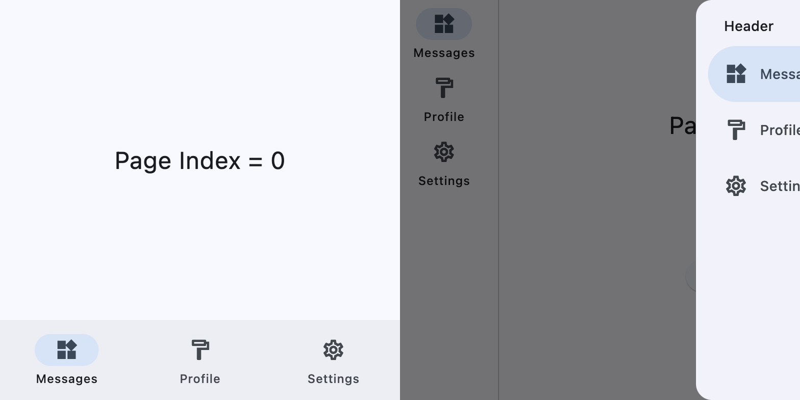
This example switches between a NavigationBar on narrow layouts and a NavigationRail with an end NavigationDrawer on wider layouts.
import flet as ft

DESTINATIONS = [
    ("Messages", ft.Icons.WIDGETS_OUTLINED, ft.Icons.WIDGETS),
    ("Profile", ft.Icons.FORMAT_PAINT_OUTLINED, ft.Icons.FORMAT_PAINT),
    ("Settings", ft.Icons.SETTINGS_OUTLINED, ft.Icons.SETTINGS),
]


def main(page: ft.Page):
    page.theme_mode = ft.ThemeMode.LIGHT
    page.padding = 0

    screen_index = 0

    def build_page_index_text() -> ft.Text:
        return ft.Text(f"Page Index = {screen_index}", size=24)

    def set_screen(index: int):
        nonlocal screen_index
        screen_index = index
        render()

    def build_navigation_bar() -> ft.NavigationBar:
        def handle_nav_bar_change(e: ft.Event[ft.NavigationBar]):
            set_screen(e.control.selected_index)

        return ft.NavigationBar(
            selected_index=screen_index,
            on_change=handle_nav_bar_change,
            destinations=[
                ft.NavigationBarDestination(
                    label=label,
                    icon=icon,
                    selected_icon=selected_icon,
                )
                for label, icon, selected_icon in DESTINATIONS
            ],
        )

    def build_navigation_rail() -> ft.NavigationRail:
        def handle_nav_rail_change(e: ft.Event[ft.NavigationRail]):
            if e.control.selected_index is not None:
                set_screen(e.control.selected_index)

        return ft.NavigationRail(
            min_width=50,
            selected_index=screen_index,
            use_indicator=True,
            on_change=handle_nav_rail_change,
            destinations=[
                ft.NavigationRailDestination(
                    label=label,
                    icon=icon,
                    selected_icon=selected_icon,
                )
                for label, icon, selected_icon in DESTINATIONS
            ],
        )

    def build_end_drawer() -> ft.NavigationDrawer:
        async def handle_drawer_change(e: ft.Event[ft.NavigationDrawer]):
            set_screen(e.control.selected_index)
            await page.close_end_drawer()

        return ft.NavigationDrawer(
            selected_index=screen_index,
            on_change=handle_drawer_change,
            controls=[
                ft.Container(
                    padding=ft.Padding.only(left=28, top=16, right=16, bottom=10),
                    content=ft.Text(
                        "Header", theme_style=ft.TextThemeStyle.TITLE_SMALL
                    ),
                ),
                *[
                    ft.NavigationDrawerDestination(
                        label=label,
                        icon=icon,
                        selected_icon=selected_icon,
                    )
                    for label, icon, selected_icon in DESTINATIONS
                ],
            ],
        )

    def build_bottom_bar_layout() -> ft.SafeArea:
        return ft.SafeArea(
            expand=True,
            content=ft.Container(
                expand=True,
                alignment=ft.Alignment.CENTER,
                content=build_page_index_text(),
            ),
        )

    def build_drawer_layout() -> ft.SafeArea:
        async def open_drawer(e: ft.Event[ft.Button]):
            await page.show_end_drawer()

        return ft.SafeArea(
            expand=True,
            avoid_intrusions_top=False,
            avoid_intrusions_bottom=False,
            content=ft.Row(
                expand=True,
                controls=[
                    ft.Container(
                        padding=ft.Padding.symmetric(horizontal=5),
                        content=build_navigation_rail(),
                    ),
                    ft.VerticalDivider(thickness=1, width=1),
                    ft.Column(
                        expand=True,
                        alignment=ft.MainAxisAlignment.SPACE_EVENLY,
                        horizontal_alignment=ft.CrossAxisAlignment.CENTER,
                        controls=[
                            build_page_index_text(),
                            ft.Button("Open Drawer", on_click=open_drawer),
                        ],
                    ),
                ],
            ),
        )

    def render():
        page.clean()
        if (page.width or page.window.width) >= 450:  # wide layout
            page.navigation_bar = None
            page.end_drawer = build_end_drawer()
            page.add(build_drawer_layout())
        else:  # narrow layout
            page.end_drawer = None
            page.navigation_bar = build_navigation_bar()
            page.add(build_bottom_bar_layout())
        page.update()

    page.on_resize = lambda e: render()
    render()


if __name__ == "__main__":
    ft.run(main)
Properties
animation_durationclass-attributeinstance-attribute
animation_duration: DurationValue | None = NoneThe transition time for each destination as it goes between selected and unselected.
bgcolorclass-attributeinstance-attribute
bgcolor: ColorValue | None = NoneThe color of the navigation bar itself.
borderclass-attributeinstance-attribute
border: Border | None = NoneThe border of the adaptive navigation bar.
This is applied only when adaptive is True and the control is rendered
as a Cupertino tab bar.
destinationsclass-attributeinstance-attribute
destinations: list[NavigationBarDestination] = field(
    default_factory=list
)
Defines the appearance of the button items that are arrayed within the navigation bar.
Raises:
- ValueError - If it does not contain at least two visible destinations.
elevationclass-attributeinstance-attribute
elevation: Number | None = NoneThe elevation of the navigation bar itself.
indicator_colorclass-attributeinstance-attribute
indicator_color: ColorValue | None = NoneThe color of the selected destination indicator.
indicator_shapeclass-attributeinstance-attribute
indicator_shape: OutlinedBorder | None = NoneThe shape of the selected destination indicator.
label_behaviorclass-attributeinstance-attribute
label_behavior: NavigationBarLabelBehavior | None = NoneDefines how the destinations' labels will be laid out and when they'll be displayed.
Can be used to show all labels, show only the selected label, or hide all labels.
Defaults to NavigationBarLabelBehavior.ALWAYS_SHOW.
label_paddingclass-attributeinstance-attribute
label_padding: PaddingValue | None = NoneThe padding around the NavigationBarDestination.label.
overlay_colorclass-attributeinstance-attribute
overlay_color: ControlStateValue[ColorValue] | None = NoneThe highlight color of the NavigationBarDestination in various ControlState states.
The following ControlState
values are supported: PRESSED, HOVERED and FOCUSED.
selected_indexclass-attributeinstance-attribute
selected_index: int = 0The index into destinations for the current selected NavigationBarDestination or None if no destination is selected.
shadow_colorclass-attributeinstance-attribute
shadow_color: ColorValue | None = NoneThe color used for the drop shadow to indicate elevation.
Events
on_changeclass-attributeinstance-attribute
on_change: ControlEventHandler[NavigationBar] | None = NoneCalled when selected destination changed.