CupertinoSlidingSegmentedButton
A cupertino sliding segmented button.
Example:
ft.CupertinoSlidingSegmentedButton(
    selected_index=1,
    controls=[
        ft.Text("One"),
        ft.Text("Two"),
        ft.Text("Three"),
    ],
)

Inherits: LayoutControl
Properties
bgcolor- The background color of this button.controls- The list of segments to be displayed.padding- The amount of space by which to inset thecontrols.proportional_width- Determine whether segments have proportional widths based on their content.selected_index- The index (starting from 0) of the selected segment in thecontrolslist.thumb_color- The color of this button when it is not selected.
Events
Examples
CupertinoSlidingSegmentedButton
import flet as ft


def main(page: ft.Page):
    page.title = "CupertinoSlidingSegmentedButton Example"
    page.theme_mode = ft.ThemeMode.LIGHT

    def handle_selection_change(e: ft.Event[ft.CupertinoSlidingSegmentedButton]):
        page.show_dialog(
            ft.SnackBar(ft.Text(f"Segment {e.control.selected_index + 1} was chosen!"))
        )

    page.add(
        ft.SafeArea(
            content=ft.CupertinoSlidingSegmentedButton(
                selected_index=1,
                thumb_color=ft.Colors.BLUE_400,
                on_change=handle_selection_change,
                controls=[
                    ft.Text("One"),
                    ft.Text("Two"),
                    ft.Text("Three"),
                ],
            ),
        )
    )


if __name__ == "__main__":
    ft.run(main)
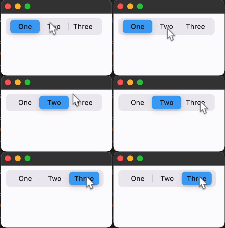
Properties
bgcolorclass-attributeinstance-attribute
bgcolor: ColorValue = CupertinoColors.TERTIARY_SYSTEM_FILLThe background color of this button.
controlsinstance-attribute
controls: list[Control]The list of segments to be displayed.
Raises:
- ValueError - If it does not contain at least two visible
Controls.
paddingclass-attributeinstance-attribute
padding: PaddingValue = field(
    default_factory=lambda: Padding.symmetric(
        vertical=2, horizontal=3
    )
)
The amount of space by which to inset the controls.
proportional_widthclass-attributeinstance-attribute
proportional_width: bool = FalseDetermine whether segments have proportional widths based on their content.
If False, all segments will have the same width, determined by the longest
segment. If True, each segment's width will be determined by its individual
content.
If the max width of parent constraints is smaller than the width that this control needs, the segment widths will scale down proportionally to ensure this control fits within the boundaries; similarly, if the min width of parent constraints is larger, the segment width will scales up to meet the min width requirement.
selected_indexclass-attributeinstance-attribute
selected_index: int = 0The index (starting from 0) of the selected segment in the controls list.
Raises:
- IndexError - If it is not between
0and the length of visiblecontrols, inclusive.
thumb_colorclass-attributeinstance-attribute
thumb_color: ColorValue | None = NoneThe color of this button when it is not selected.
Events
on_changeclass-attributeinstance-attribute
on_change: (
    ControlEventHandler[CupertinoSlidingSegmentedButton]
    | None
) = None
Called when the state of the button is changed - when one of the controls is clicked.