SearchBar
Manages a "search view" route that allows the user to select one of the suggested completions for a search query.
Example:
ft.SearchBar(bar_hint_text="Search...")

Inherits: LayoutControl
Properties
autofocus- Whether the text field should focus itself if nothing else is already focused.bar_bgcolor- Defines the background color of the search bar in all or specificControlStatestates.bar_border_side- The color and weight of the search bar's outline.bar_elevation- The elevation of the search bar.bar_hint_text- Defines the text to be shown in the search bar when it is empty and the search view is close.bar_hint_text_style- The style to use for theSearchBar.bar_hint_text.bar_leading- A control to display before the text input field when the search view is close.bar_overlay_color- Defines the highlight color that's typically used to indicate that the search bar is inControlState.FOCUSED,ControlState.HOVERED, orControlState.PRESSEDstates.bar_padding- The padding between the search bar's boundary and its contents.bar_scroll_padding- Configures the padding around a Scrollable when the text field scrolls into view.bar_shadow_color- The shadow color of the search bar.bar_shape- The shape of the search bar.bar_size_constraints- Optional size constraints for the search bar.bar_text_style- The style to use for the text being edited.bar_trailing- A list of controls to display after the text input field when the search view is close.capitalization- Enables automatic on-the-fly capitalization of entered text.controls- The list of controls to be displayed below the search bar when in search view.divider_color- The color of the divider when in search view.full_screen- Defines whether the search view grows to fill the entire screen when the search bar is tapped.keyboard_type- The type of action button to use for the keyboard.shrink_wrap- Whether the search view should shrink-wrap its contents.value- The text in the search bar.view_bar_padding- The padding to use for the search view's search bar.view_bgcolor- Defines the background color of the search view.view_elevation- Defines the elevation of the search view.view_header_height- The height of the search field on the search view.view_header_text_style- Defines the text style of the text being edited on the search view.view_hint_text- Defines the text to be displayed when the search bar's input field is empty.view_hint_text_style- Defines the text style ofview_hint_text.view_leading- AControlto display before the text input field when the search view is open.view_padding- The padding to use for the search view.view_shape- Defines the shape of the search view.view_side- Defines the color and weight of the search view's outline.view_size_constraints- Optional size constraints for the search view.view_trailing- A list ofControls to display after the text input field when the search view is open.
Events
on_blur- Fired when the search bar loses focus.on_change- Called when the typed input in the search bar has changed.on_focus- Fired when the search bar gains focus.on_submit- Called when user presses ENTER while focus is on SearchBar.on_tap- Called when the search bar is tapped.on_tap_outside_bar- Fired when a pointer-down event occurs outside the search bar while the bar is focused and the search view is closed.on_tap_outside_view- Fired when the user taps outside the search view while it is open (for example, on the surrounding barrier that dismisses it).
Methods
close_view- Closes an opened search view.focus- Requests focus for this control.open_view- Opens the search view.
Examples
SearchBar
import flet as ft

colors = [
    "Amber",
    "Blue Grey",
    "Brown",
    "Deep Orange",
    "Green",
    "Light Blue",
    "Orange",
    "Red",
]


def main(page: ft.Page):
    page.horizontal_alignment = ft.CrossAxisAlignment.CENTER

    def build_tiles(items: list[str]) -> list[ft.Control]:
        return [
            ft.ListTile(
                title=ft.Text(item),
                data=item,
                on_click=handle_tile_click,
            )
            for item in items
        ]

    async def handle_tile_click(e: ft.Event[ft.ListTile]):
        await anchor.close_view()

    async def handle_change(e: ft.Event[ft.SearchBar]):
        query = e.control.value.strip().lower()
        matching = (
            [color for color in colors if query in color.lower()] if query else colors
        )
        anchor.controls = build_tiles(matching)

    def handle_submit(e: ft.Event[ft.SearchBar]):
        print(f"Submit: {e.data}")

    async def handle_tap(e: ft.Event[ft.SearchBar]):
        await anchor.open_view()

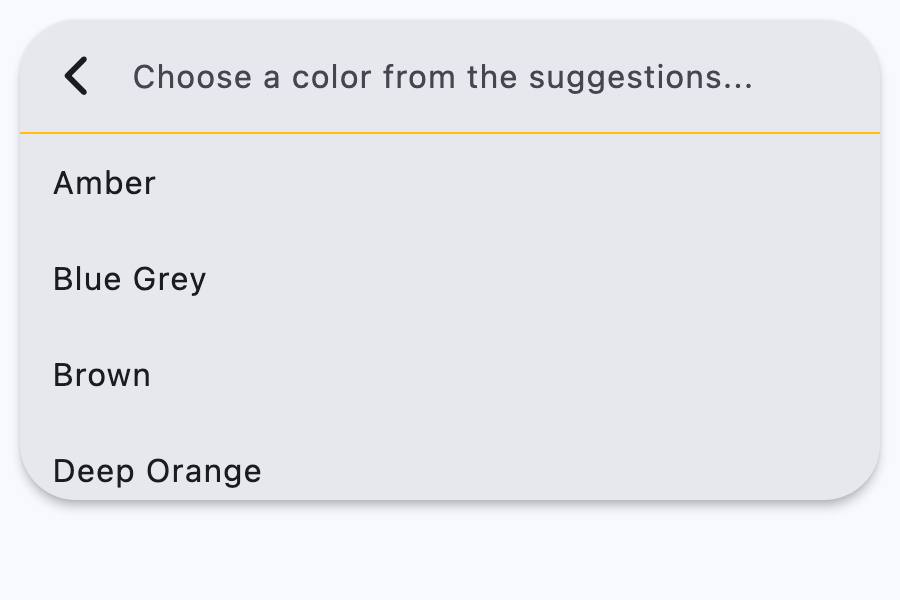
    anchor = ft.SearchBar(
        view_elevation=4,
        divider_color=ft.Colors.AMBER,
        bar_hint_text="Search colors...",
        view_hint_text="Choose a color from the suggestions...",
        on_change=handle_change,
        on_submit=handle_submit,
        on_tap=handle_tap,
        controls=build_tiles(colors),
    )

    page.add(ft.SafeArea(content=anchor))


if __name__ == "__main__":
    ft.run(main)
Properties
autofocusclass-attributeinstance-attribute
autofocus: bool = FalseWhether the text field should focus itself if nothing else is already focused.
bar_bgcolorclass-attributeinstance-attribute
bar_bgcolor: ControlStateValue[ColorValue] | None = NoneDefines the background color of the search bar in all or specific ControlState states.
bar_border_sideclass-attributeinstance-attribute
bar_border_side: ControlStateValue[BorderSide] | None = NoneThe color and weight of the search bar's outline.
This value is combined with bar_shape to
create a shape decorated with an outline.
bar_elevationclass-attributeinstance-attribute
bar_elevation: ControlStateValue[Number | None] | None = (
    None
)
The elevation of the search bar.
bar_hint_textclass-attributeinstance-attribute
bar_hint_text: str | None = NoneDefines the text to be shown in the search bar when it is empty and the search view is close.
Usually some text that suggests what sort of input the field accepts.
bar_hint_text_styleclass-attributeinstance-attribute
bar_hint_text_style: ControlStateValue[TextStyle] | None = (
    None
)
The style to use for the SearchBar.bar_hint_text.
bar_leadingclass-attributeinstance-attribute
bar_leading: Control | None = NoneA control to display before the text input field when the search view is close.
Typically an Icon or an IconButton.
bar_overlay_colorclass-attributeinstance-attribute
bar_overlay_color: ControlStateValue[ColorValue] | None = (
    None
)
Defines the highlight color that's typically used to indicate that the search bar is in ControlState.FOCUSED, ControlState.HOVERED, or ControlState.PRESSED states.
bar_paddingclass-attributeinstance-attribute
bar_padding: ControlStateValue[PaddingValue] | None = NoneThe padding between the search bar's boundary and its contents.
bar_scroll_paddingclass-attributeinstance-attribute
bar_scroll_padding: PaddingValue = 20Configures the padding around a Scrollable when the text field scrolls into view.
If the bar's text field is partially off-screen or covered (e.g., by the keyboard), it scrolls into view, ensuring it is positioned at the specified distance from the Scrollable edges.
bar_shadow_colorclass-attributeinstance-attribute
bar_shadow_color: ControlStateValue[ColorValue] | None = (
    None
)
The shadow color of the search bar.
bar_shapeclass-attributeinstance-attribute
bar_shape: ControlStateValue[OutlinedBorder] | None = NoneThe shape of the search bar.
This shape is combined with bar_border_side to create a shape
decorated with an outline.
bar_size_constraintsclass-attributeinstance-attribute
bar_size_constraints: BoxConstraints | None = NoneOptional size constraints for the search bar.
bar_text_styleclass-attributeinstance-attribute
bar_text_style: ControlStateValue[TextStyle] | None = NoneThe style to use for the text being edited.
bar_trailingclass-attributeinstance-attribute
bar_trailing: list[Control] | None = NoneA list of controls to display after the text input field when the search view is close.
These controls can represent additional modes of searching (e.g voice search), an avatar, or an overflow menu and are usually not more than two.
capitalizationclass-attributeinstance-attribute
capitalization: TextCapitalization | None = NoneEnables automatic on-the-fly capitalization of entered text.
controlsclass-attributeinstance-attribute
controls: list[Control] = field(default_factory=list)The list of controls to be displayed below the search bar when in search view.
divider_colorclass-attributeinstance-attribute
divider_color: ColorValue | None = NoneThe color of the divider when in search view.
full_screenclass-attributeinstance-attribute
full_screen: bool = FalseDefines whether the search view grows to fill the entire screen when the search bar is tapped.
keyboard_typeclass-attributeinstance-attribute
keyboard_type: KeyboardType = KeyboardType.TEXTThe type of action button to use for the keyboard.
shrink_wrapclass-attributeinstance-attribute
shrink_wrap: bool | None = NoneWhether the search view should shrink-wrap its contents.
view_bar_paddingclass-attributeinstance-attribute
view_bar_padding: PaddingValue | None = NoneThe padding to use for the search view's search bar.
If null, then the default value is 8.0 horizontally.
view_bgcolorclass-attributeinstance-attribute
view_bgcolor: ColorValue | None = NoneDefines the background color of the search view.
view_elevationclass-attributeinstance-attribute
view_elevation: Number | None = NoneDefines the elevation of the search view.
view_header_heightclass-attributeinstance-attribute
view_header_height: Number | None = NoneThe height of the search field on the search view.
view_header_text_styleclass-attributeinstance-attribute
view_header_text_style: TextStyle | None = NoneDefines the text style of the text being edited on the search view.
view_hint_textclass-attributeinstance-attribute
view_hint_text: str | None = NoneDefines the text to be displayed when the search bar's input field is empty.
view_hint_text_styleclass-attributeinstance-attribute
view_hint_text_style: TextStyle | None = NoneDefines the text style of view_hint_text.
view_leadingclass-attributeinstance-attribute
view_leading: Control | None = NoneA Control to display before the text input field when the search view is open.
Typically an Icon or an IconButton.
Defaults to a back button which closes/pops the search view.
view_paddingclass-attributeinstance-attribute
view_padding: PaddingValue | None = NoneThe padding to use for the search view.
Has no effect if the search view is full-screen.
view_shapeclass-attributeinstance-attribute
view_shape: OutlinedBorder | None = NoneDefines the shape of the search view.
view_sideclass-attributeinstance-attribute
view_side: BorderSide | None = NoneDefines the color and weight of the search view's outline.
view_size_constraintsclass-attributeinstance-attribute
view_size_constraints: BoxConstraints | None = NoneOptional size constraints for the search view.
By default, the search view has the same width as the search bar and is 2/3 the height of the screen. If the width and height of the view are within the view_size_constraints, the view will show its default size. Otherwise, the size of the view will be constrained by this property.
Events
on_blurclass-attributeinstance-attribute
on_blur: ControlEventHandler[SearchBar] | None = NoneFired when the search bar loses focus.
on_changeclass-attributeinstance-attribute
on_change: ControlEventHandler[SearchBar] | None = NoneCalled when the typed input in the search bar has changed.
on_focusclass-attributeinstance-attribute
on_focus: ControlEventHandler[SearchBar] | None = NoneFired when the search bar gains focus.
on_submitclass-attributeinstance-attribute
on_submit: ControlEventHandler[SearchBar] | None = NoneCalled when user presses ENTER while focus is on SearchBar.
on_tapclass-attributeinstance-attribute
on_tap: ControlEventHandler[SearchBar] | None = NoneCalled when the search bar is tapped.
on_tap_outside_barclass-attributeinstance-attribute
on_tap_outside_bar: (
    ControlEventHandler[SearchBar] | None
) = None
Fired when a pointer-down event occurs outside the search bar while the bar is focused and the search view is closed.
This mirrors TextField.on_tap_outside. To react to taps outside
the search view while it is open, use on_tap_outside_view instead.
on_tap_outside_viewclass-attributeinstance-attribute
on_tap_outside_view: (
    ControlEventHandler[SearchBar] | None
) = None
Fired when the user taps outside the search view while it is open (for example, on the surrounding barrier that dismisses it).
Tapping the view's own search field or one of the suggestions does not fire this event.