SubmenuButton
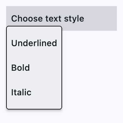
A menu button that displays a cascading menu.
Typically used in a MenuBar control.
ft.SubmenuButton(
    content=ft.Text("Choose text style"),
    key="smbutton",
    expand=True,
    menu_style=ft.MenuStyle(
        alignment=ft.Alignment.BOTTOM_LEFT, side=ft.BorderSide(1)
    ),
    controls=[
        ft.MenuItemButton(
            content=ft.Text("Underlined"),
            on_click=lambda e: print(f"{e.control.content.value}.on_click"),
        ),
        ft.MenuItemButton(...),
        ...,
    ],
)
Inherits: LayoutControl
Properties
alignment_offset- The offset of the menu relative to the alignment origin determined byMenuStyle.alignmenton thestyleattribute.clip_behavior- Whether to clip the content of this control or not.content- The child control to be displayed in the middle portion of this button.controls- A list of controls that appear in the menu when it is opened.leading- An optional control to display before thecontent.menu_style- Customizes this menu's appearance.style- Customizes this button's appearance.trailing- An optional control to display after thecontent.
Events
Examples
SubmenuButton
import flet as ft


def main(page: ft.Page):
    page.padding = 0
    page.spacing = 0

    def handle_color_click(e: ft.Event[ft.MenuItemButton]):
        color = e.control.content.value
        background_container.content.value = f"{color} background color"
        background_container.bgcolor = color.lower()

    def handle_alignment_click(e: ft.Event[ft.MenuItemButton]):
        background_container.alignment = e.control.data

    def handle_on_hover(e: ft.Event[ft.MenuItemButton]):
        print(f"{e.control.content.value}.on_hover")

    menubar = ft.MenuBar(
        expand=True,
        controls=[
            ft.SubmenuButton(
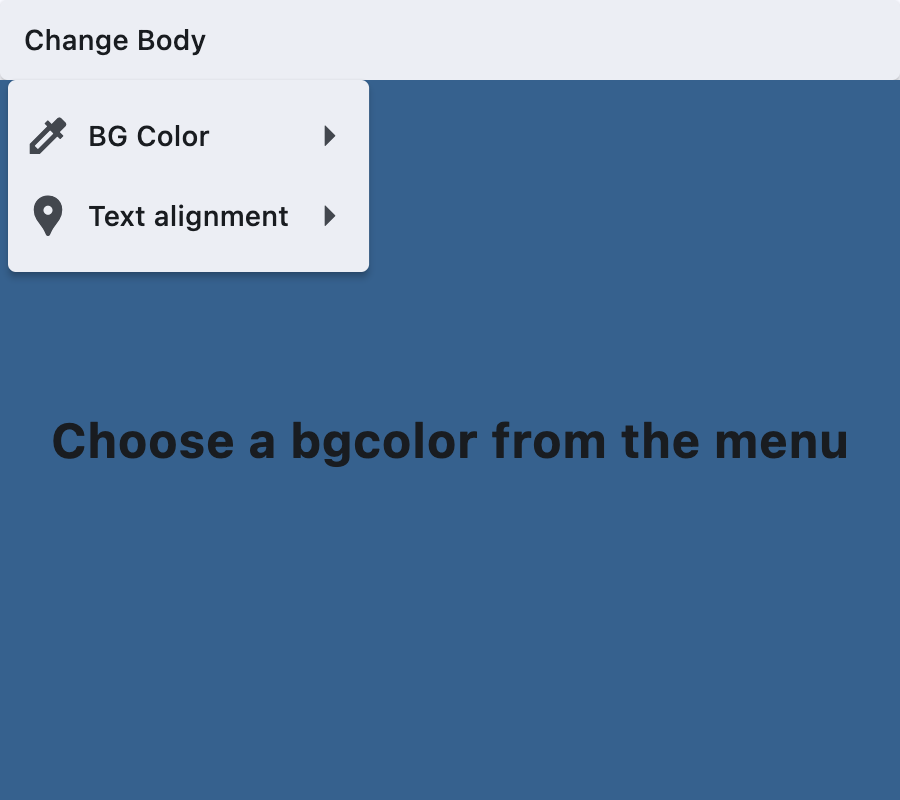
                content=ft.Text("Change Body"),
                key="submenubutton",
                controls=[
                    ft.SubmenuButton(
                        content=ft.Text("BG Color"),
                        leading=ft.Icon(ft.Icons.COLORIZE),
                        controls=[
                            ft.MenuItemButton(
                                content=ft.Text("Blue"),
                                on_click=handle_color_click,
                                on_hover=handle_on_hover,
                                style=ft.ButtonStyle(
                                    bgcolor={ft.ControlState.HOVERED: ft.Colors.BLUE}
                                ),
                            ),
                            ft.MenuItemButton(
                                content=ft.Text("Green"),
                                on_click=handle_color_click,
                                on_hover=handle_on_hover,
                                style=ft.ButtonStyle(
                                    bgcolor={ft.ControlState.HOVERED: ft.Colors.GREEN}
                                ),
                            ),
                            ft.MenuItemButton(
                                content=ft.Text("Red"),
                                on_click=handle_color_click,
                                on_hover=handle_on_hover,
                                style=ft.ButtonStyle(
                                    bgcolor={ft.ControlState.HOVERED: ft.Colors.RED}
                                ),
                            ),
                        ],
                    ),
                    ft.SubmenuButton(
                        content=ft.Text("Text alignment"),
                        leading=ft.Icon(ft.Icons.LOCATION_PIN),
                        controls=[
                            ft.MenuItemButton(
                                content=ft.Text("bottom_center"),
                                data=ft.Alignment.BOTTOM_CENTER,
                                on_click=handle_alignment_click,
                                style=ft.ButtonStyle(
                                    bgcolor={
                                        ft.ControlState.HOVERED: ft.Colors.GREY_100
                                    }
                                ),
                            ),
                            ft.MenuItemButton(
                                content=ft.Text("bottom_left"),
                                data=ft.Alignment.BOTTOM_LEFT,
                                on_click=handle_alignment_click,
                                style=ft.ButtonStyle(
                                    bgcolor={
                                        ft.ControlState.HOVERED: ft.Colors.GREY_100
                                    }
                                ),
                            ),
                            ft.MenuItemButton(
                                content=ft.Text("top_center"),
                                data=ft.Alignment.TOP_CENTER,
                                on_click=handle_alignment_click,
                                style=ft.ButtonStyle(
                                    bgcolor={
                                        ft.ControlState.HOVERED: ft.Colors.GREY_100
                                    }
                                ),
                            ),
                            ft.MenuItemButton(
                                content=ft.Text("center_left"),
                                data=ft.Alignment.CENTER_LEFT,
                                on_click=handle_alignment_click,
                                style=ft.ButtonStyle(
                                    bgcolor={
                                        ft.ControlState.HOVERED: ft.Colors.GREY_100
                                    }
                                ),
                            ),
                            ft.MenuItemButton(
                                content=ft.Text("center_right"),
                                data=ft.Alignment.CENTER_RIGHT,
                                on_click=handle_alignment_click,
                                style=ft.ButtonStyle(
                                    bgcolor={
                                        ft.ControlState.HOVERED: ft.Colors.GREY_100
                                    }
                                ),
                            ),
                        ],
                    ),
                ],
            )
        ],
    )

    page.add(
        ft.SafeArea(
            expand=True,
            content=ft.Column(
                expand=True,
                spacing=0,
                controls=[
                    ft.Row(controls=[menubar]),
                    background_container := ft.Container(
                        expand=True,
                        bgcolor=ft.Colors.SURFACE_TINT,
                        alignment=ft.Alignment.CENTER,
                        content=ft.Text(
                            value="Choose a bgcolor from the menu",
                            style=ft.TextStyle(size=24, weight=ft.FontWeight.BOLD),
                        ),
                    ),
                ],
            ),
        )
    )


if __name__ == "__main__":
    ft.run(main)
Standalone SubmenuButton
import flet as ft


def main(page: ft.Page):
    page.theme_mode = ft.ThemeMode.LIGHT

    smb = ft.SubmenuButton(
        expand=True,
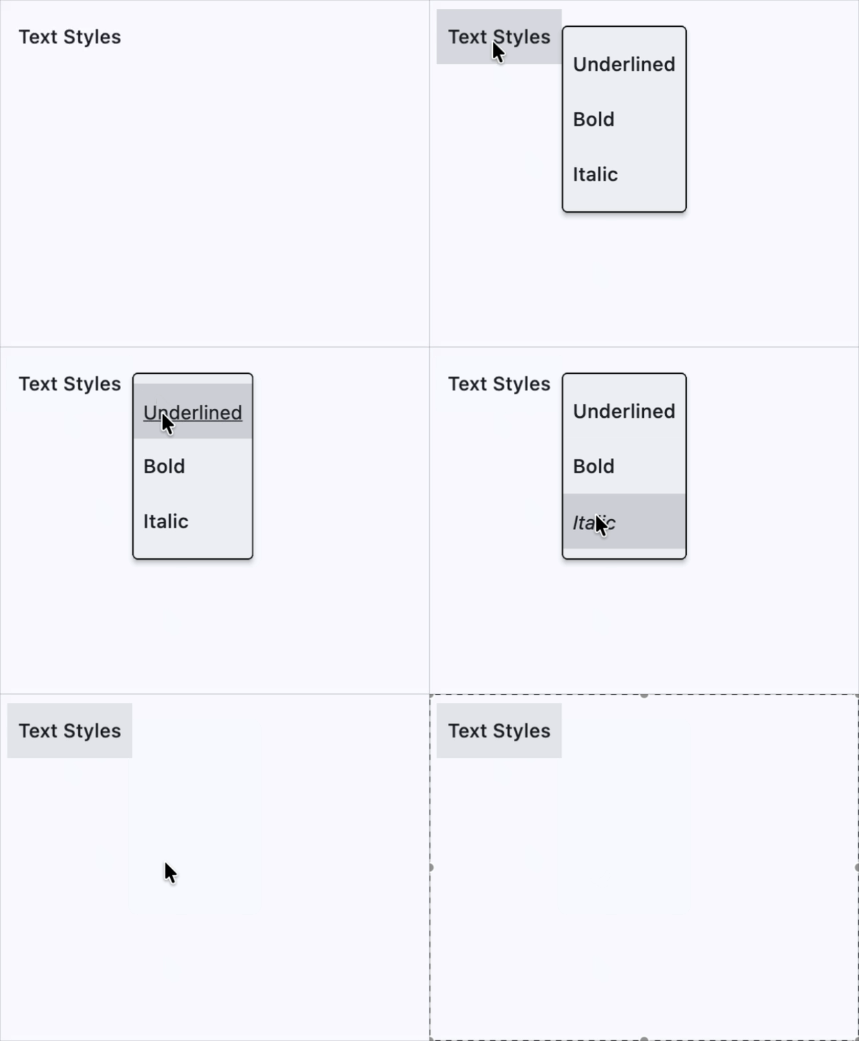
        content=ft.Text("Text Styles"),
        key="smbutton",
        menu_style=ft.MenuStyle(
            alignment=ft.Alignment.CENTER_RIGHT, side=ft.BorderSide(1)
        ),
        controls=[
            ft.MenuItemButton(
                content=ft.Text("Underlined"),
                on_click=lambda e: print(f"{e.control.content.value}.on_click"),
                style=ft.ButtonStyle(
                    text_style={
                        ft.ControlState.HOVERED: ft.TextStyle(
                            decoration=ft.TextDecoration.UNDERLINE
                        )
                    }
                ),
            ),
            ft.MenuItemButton(
                content=ft.Text("Bold"),
                on_click=lambda e: print(f"{e.control.content.value}.on_click"),
                style=ft.ButtonStyle(
                    text_style={
                        ft.ControlState.HOVERED: ft.TextStyle(weight=ft.FontWeight.BOLD)
                    }
                ),
            ),
            ft.MenuItemButton(
                content=ft.Text("Italic"),
                on_click=lambda e: print(f"{e.control.content.value}.on_click"),
                style=ft.ButtonStyle(
                    text_style={ft.ControlState.HOVERED: ft.TextStyle(italic=True)}
                ),
            ),
        ],
    )

    page.add(
        ft.SafeArea(
            content=ft.Row(controls=[smb]),
        )
    )


if __name__ == "__main__":
    ft.run(main)
Properties
alignment_offsetclass-attributeinstance-attribute
alignment_offset: OffsetValue | None = NoneThe offset of the menu relative to the alignment origin determined by MenuStyle.alignment on the style attribute.
clip_behaviorclass-attributeinstance-attribute
clip_behavior: ClipBehavior = ClipBehavior.HARD_EDGEWhether to clip the content of this control or not.
contentclass-attributeinstance-attribute
content: StrOrControl | None = NoneThe child control to be displayed in the middle portion of this button.
Typically this is the button's label, using a Text control.
controlsclass-attributeinstance-attribute
controls: list[Control] = field(default_factory=list)A list of controls that appear in the menu when it is opened.
Typically either MenuItemButton or
SubMenuButton controls.
If this list is empty, then the button for this menu item will be disabled.
leadingclass-attributeinstance-attribute
leading: Control | None = NoneAn optional control to display before the content.
Typically an Icon control.
menu_styleclass-attributeinstance-attribute
menu_style: MenuStyle | None = NoneCustomizes this menu's appearance.
styleclass-attributeinstance-attribute
style: ButtonStyle | None = NoneCustomizes this button's appearance.
Events
on_blurclass-attributeinstance-attribute
on_blur: ControlEventHandler[SubmenuButton] | None = NoneCalled when this button loses focus.
on_closeclass-attributeinstance-attribute
on_close: ControlEventHandler[SubmenuButton] | None = NoneCalled when the menu is closed.
on_focusclass-attributeinstance-attribute
on_focus: ControlEventHandler[SubmenuButton] | None = NoneCalled when the button receives focus.
on_hoverclass-attributeinstance-attribute
on_hover: ControlEventHandler[SubmenuButton] | None = NoneCalled when the button is hovered.
on_openclass-attributeinstance-attribute
on_open: ControlEventHandler[SubmenuButton] | None = NoneCalled when the menu is opened.